セミナーアーカイブ動画のお申込み
≪特別セミナーのご案内≫
他社事例でわかる!人事課題解決として有効な社員寮サービスとは
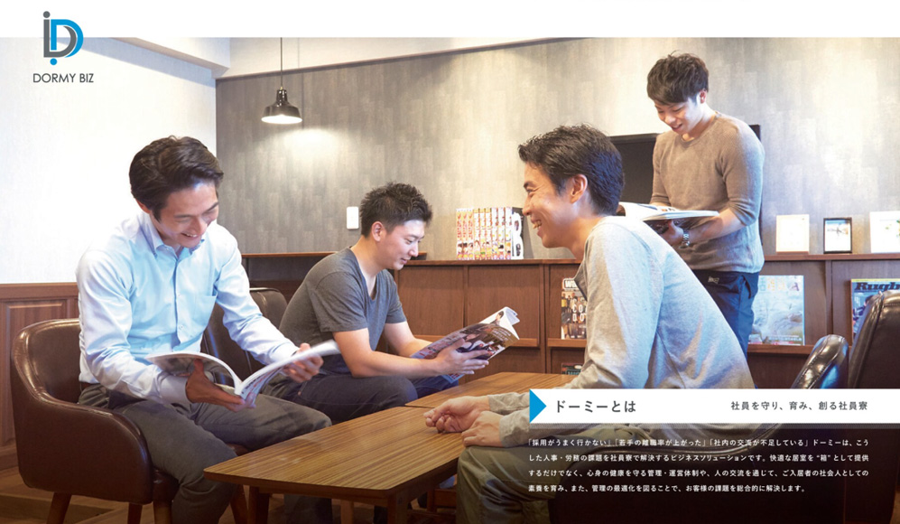
社員寮の活用とは、社員へ住まいを提供するだけだと思っていませんか?
社員寮を導入することで、会社にとっても社員にとっても様々な効果を得ることができます。
具体的な導入例を交えながら解説しますので、ぜひご参加ください!
セミナーアーカイブ動画の概要
【視聴方法】
いつでも視聴可能(12/23オンラインセミナーアーカイブ動画)
【セミナー内容】
他社事例でわかる!人事課題解決として有効な社員寮サービスとは
企業様がどのように人事課題を解決したのか、実際に導入している企業様の例も交えながら、社員寮導入の効果をご説明いたします。
【こんな方におすすめ】
- 社員寮に興味をお持ちの方
- 採用力強化をしていきたい方
- 若手社員の離職率にお悩みの方
- 社員寮の導入を検討している方
【主なトピック】
- 社員寮ドーミーについて
- 社員寮導入による効果~法人メリット~
- 社員寮導入による効果~ご入居者メリット~
| 視聴方法 |
いつでも視聴可能(12/23オンラインセミナーアーカイブ動画) |
| セミナーアーカイブ動画 |
他社事例でわかる!人事課題解決として有効な社員寮サービスとは |
| 費用 |
無料 |
| こんな方におススメ! |
社員寮に興味をお持ちの方
採用力強化をしていきたい方
若手社員の離職率にお悩みの方
社員寮の導入を検討している方 |
@charset "UTF-8";
/* LF default */
/* ===================================
基本設定
=================================== */
html{ overflow-y:scroll; }
html, body, div, span, applet, object, iframe,
h1, h2, h3, h4, h5, h6, p, blockquote, pre,
a, abbr, acronym, address, big, cite, code,
del, dfn, em, font, img, ins, kbd, q, s, samp,
small, strike, strong, sub, sup, tt, var,
b, u, i, center,
dl, dt, dd, ol, ul, li,
fieldset, form, label, legend,
table, caption, tbody, tfoot, thead, tr, th, td {
margin: 0;
padding: 0;
font-weight: normal;
font-style: normal;
}
li { list-style: none; }
/* ===================================
共通
=================================== */
/* フォント */
body {
font-family: Verdana, Roboto, 'Droid Sans', Meiryo, 'MS Pゴシック', 'Hiragino Kaku Gothic ProN', sans-serif;
}
select,input,button,textarea {
font-family: Verdana, Roboto, 'Droid Sans', Meiryo, 'MS Pゴシック', 'Hiragino Kaku Gothic ProN', sans-serif;
}
/* ===================================
画面全体のレイアウト
=================================== */
/* 画面全体の表示設定 */
body {
text-align:left; /* フォームエリアを中央に表示 */
position:relative;
}
body:before {
content: "";
display: block;
width: 100%;
height: 500px;
background: #fff;
position: absolute;
top: 70px;
left: 0;
z-index: -1;
}
/* フォームエリア全体の設定 */
div.container {
width:1024px; /* 画面の横幅 */
font-size:14px; /* フォントの初期サイズ */
color:#333; /* フォントの初期カラー */
margin:0 auto; /* 画面の中央に表示 */
text-align:left; /* 左寄せ */
}
/* ===================================
設問エリアのレイアウト
=================================== */
/* 設問エリア全体の設定 */
div.wrapper {
width:auto; /* 画面の横幅 */
margin:0 auto; /* 中央に表示 */
background:#f4f4f4;
padding:20px;
}
/* 設問の表 */
table.items {
border-collapse: collapse;
border-spacing: 0;
}
/* 設問の行 */
tr.item { border-bottom:10px solid #f4f4f4} /* 必要であれば行のデザインを設定することができます */
/*設問名のセルのデザイン */
td.label {
width:230px; /* 実際の設問名の文字の長さに合わせて調整してください */
padding:4px 0 4px 5px;
color:#224;
font-size:14px;
font-weight:bold;
vertical-align:top; /* ラベルの配置 セルの上部に表示したい場合は top */
}
/* 設問の入力セルおよび表示セルのデザイン */
td.value {
width:360px; /* 入力コントロールの幅に合わせて調整してください */
padding:3px 3px 0 10px;
font-size:14px;
}
/* 設問の入力例/説明セルのデザイン */
td.comment {
font-size:12px;
padding-left:10px;
color:DarkSlateGray;
}
/* 入力セルの「氏」「名」の文字のデザイン */
span.label_name {
padding-right:5px;
font-size:85%;
font-weight:bold;
color:DarkSlateGray;
}
/* 入力確認画面、完了画面の入力された文字のデザイン */
p.value {
font-size:110%;
}
/* ボタンの表示エリアの設定 */
div.button_area {
width:auto;
margin:auto; /* 中央に表示、上下に10pxの余白 */
padding:20px 0 50px ; /* ボタンとの上下の隙間のサイズ */
text-align:center; /* 中央にボタンを表示 */
background: #f4f4f4;
}
/* 入力エラーメッセージのデザイン */
div.message {
padding:5px 10px 5px 10px; /* メッセージテキストと背景色の隙間のサイズ */
margin:10px 13px 10px 13px; /* 上 右 下 左 の隙間のサイズ */
font-size:14px;
font-weight:bold;
color:OrangeRed;
background:LightYellow;
}
/* 公開終了メッセージのデザイン */
div.finished-message {
padding:5px 10px 5px 10px; /* メッセージテキストと背景色の隙間のサイズ */
margin:10px 13px 10px 13px; /* 上 右 下 左 の隙間のサイズ */
font-size:14px;
font-weight:bold;
color:Crimson;
background:MistyRose;
}
/* ===================================
入力コントロールのデザイン
=================================== */
/* 確認/送信/戻る/登録ボタン */
input[type=button] {
font-size:18px;
background:#f07651;; /* ボタンの色 */
padding:15px 50px; /* ボタンの文字の 上 右 下 左 の隙間のサイズ */
margin:0px 10px 0px 10px; /* 確認画面に表示される2つのボタンの左右の余白サイズ */
border:none; /* ボタンに枠線をつけたい場合は、ここを設定してください */
color:white; /* 文字の色 */
font-weight:bold;
}
input[type=button]:hover { cursor: pointer; }
/* 入力中のフィールドの背景色 */
/* それぞれの入力フィールドにカーソルが移動したときに背景の色が変わります。不要な場合は削除してください。 */
input[type="text"]:focus { background-color:LightYellow; } /* テキストボックス */
select:focus { background-color:LightYellow; } /* プルダウン */
textarea:focus { background-color:LightYellow; } /* テキストエリア */
/* ===================================
必須項目のマークおよびメッセージなど
=================================== */
/* 必須項目のマーク */
span.required {
float:right;
margin-right:4px;
font-size:60%;
font-weight:bold;
color:#d10000;
}
span.required:after {
/* ここを編集することで表示されるマークを変更できます */
content:"*";
}
/* 必須項目についての説明文 */
p.required_msg {
text-align:right;
margin-right:4px;
font-size:80%;
font-weight:bold;
color:#d10000;
margin-bottom:5px;
}
p.required_msg:after {
/* ここを編集することで表示されるマークを変更できます */
content:"*必須入力";
}
/* メールアドレスの再入力メッセージ */
p.label_mail {
margin:5px 0 1px 0;
font-size:85%;
font-weight:bold;
color:DarkSlateGray;
}
p.label_mail:after {
/* ここを編集することで表示されるメッセージを変更できます */
content:"確認のため、もう一度メールアドレスを入力してください";
}
/* ===================================
スマートフォン表示用のレイアウト
=================================== */
/* スマートフォンとして認識する画面の横幅のサイズ */
@media screen and ( max-width:767px ) {
/* フォームエリア全体の設定 */
div.container {
width: 100%;
}
/* 設問エリア全体の設定 */
div.wrapper {
width: auto;
padding: 20px 10px;
}
/* 設問の表 */
table.items {
width: 100%;
}
/*設問名のセルのデザイン */
td.label {
float: left;
width: 95%;
height: auto;
padding-top:10px;
padding-bottom:10px;
font-size: 22px;
padding-left: 0px;
}
/* 必須項目のマーク */
span.required {
float:initial;
}
/* 設問の入力セルおよび表示セルのデザイン */
td.value {
float: left;
width: 95%; /* 入力コントロールの幅に合わせて調整してください */
padding-bottom: 0px;
padding-left: 0px;
font-size: 16px;
}
/* 設問の入力例/説明セルのデザイン */
td.comment {
float: left;
width: 95%;
padding: 10px 2px 10px 2px;
font-size: 16px;
}
/* 設問の入力例/テキストボックス */
input[type="text"]{
font-size: 120%;
width: 95% !important;
}
/* 設問の入力例/テキストエリア */
textarea {
width: 95%;
font-size: 120%;
height: 100px;
}
/* ボタンの表示エリアの設定 */
div.button_area {
width: auto;
}
}
header {
width: 100%;
height: 70px;
background: #fff;
top: 0;
left: 0;
transition: all .3s;
position: fixed;
border-bottom: solid 1px #eee;
z-index: 200;
transform: translate3d(0, 0, 0);
position: absolute;
}
.common-head h1 {
width: 154px;
height: 70px;
display: block;
position: relative;
z-index: 5;
overflow:hidden;
}
.common-head h1 a {
display: block;
height: 69px;
background: #0287c5;
padding: 16px;
}
.common-head h1 a:hover {
background: #40a8d9;
}
.common-head h1 span {
display: none;
}
header.common-head img.top-head-only {
display: none;
}
header.common-head img.common-head-only {
display: inline-block;
}
#wrapper {
padding:70px 0;
}
/*-----------------------------------------------------------------------------
single-ttl
------------------------------------------------------------------------------*/
.single-ttl-wrap {
width: 100%;
padding: 60px 0 40px;
text-align: center;
position: relative;
z-index: 1;
}
.scrum-ttl {
font-size: 24px;
font-weight:bold;
color: #0287c5;
line-height:1.2em;
display: inline-block;
padding: 0.5em 2em;
border: solid 2px #0287c5;
}
@media screen and (max-width: 767px) {
.single-ttl-wrap {
padding: 30px 0 30px;
}
.scrum-ttl {
font-size: 20px;
font-size: 2.0rem;
}
}
.mid {
font-size: 16px;
}
.mB_20 {
margin-bottom: 20px !important;
}
.center {
text-align: center !important;
}
.static-wrap {
background:#fff;
padding: 60px;
}
input[type="text"] ,input[type="email"] {
padding:8px 5px;
}
#item_0 input,
#item_4 input,
#item_7 input{
width:calc(100% - 10px) !important;
}
#item_5 input,
#item_6 input,
#item_9 input{
width:calc(70% - 10px) !important;
}
#item_1 textarea{
padding:8px 5px;
height:20px;
width:calc(100% - 10px) !important;
}
#item_26 textarea{
padding:8px 5px;
height:38px;
width:calc(100% - 10px) !important;
}
#item_11 textarea{
padding:8px 5px;
height:80px;
width:calc(100% - 10px) !important;
}
#item_8 input,
#item_10 input,
#item_12 input{
margin:5px 5px 5px 0;
}
#item_2 input,
#item_3 input{
width:130px;
}
footer {
width: 100%;
position: absolute;
bottom:0;
left:0;
margin-top: 30px;
}
.footer-copy {
width: 100%;
text-align: center;
padding: 30px 0;
border-top: solid 1px #ccc;
}
.privacy_policy {
background: #f4f4f4;
margin: 0;
padding: 30px;
}
.form-wrap {
display: table;
width: 100%;
margin-bottom: 40px;
padding: 60px 40px;
}
.form-thx {
font-size: 50px;
padding-top: 60px;
margin-bottom: 40px;
text-align: center;
}
#frm_formthanks .wrapper {
display:none;
}
@media screen and ( max-width:767px ) {
.scrum-ttl {
font-size: 4.8vw;
}
.static-wrap {
background: transparent;
padding: 20px 10px;
}
.mid {
font-size: 14px;
}
#item_5 input,
#item_6 input,
#item_9 input{
width:calc(100% - 10px) !important;
}
#item_2 input,
#item_3 input{
width:calc(100% - 40px) !important;
}
#item_2 input:last-child,
#item_3 input:last-child{
margin-top:10px;
}
span.label_name {
font-size: 16px;
}
.privacy_policy {
padding:0 10px 30px;
}
.form-wrap {
margin-bottom: 18vw;
padding: 10vw 4vw;
width: auto;
}
}
/*-----------------------------------------------------------------------------
プライバシーポリシー改修
------------------------------------------------------------------------------*/
#privacy_policy {
/* display:none; */
}
#privacy_policy a {
color: #00f;
text-decoration: underline;
}
.agree {
text-align:center;
line-height:1.8em;
margin:20px 0 0;
}
.ppttl {
text-align:center;
margin:0 0 20px;
}
div.lfpp .scrum-ttl {
font-size: 16px;
color: #0287c5;
display: inline-block;
padding: 0.3em 2em;
border: solid 2px #0287c5;
}
div.lfpp {
margin:40px 0 0;
width:auto;
height:200px;
padding:20px;
overflow:hidden;
font-size:12px;
line-height:1.5em;
border:1px solid #ccc;
overflow-y: scroll;
}
div.lfpp h2.pp-ttl {
font-size:14px;
font-weight:bold;
margin:0 0 10px;
}
div.lfpp .mid {
font-size: 12px;
margin:0 0 10px;
}
div.lfpp section.block h2.border-ttl {
font-size:14px;
font-weight:bold;
border-bottom: solid 1px #0287c5;
margin:0 0 15px;
padding:0 0 5px;
}
div.lfpp .def-ttl {
margin-bottom: 5px;
font-weight: 700;
}
div.lfpp .def-ttl:before {
content: "■";
color: #0287c5;
display: inline-block;
margin-right: 3px;
}
div.lfpp .gray-box {
background-color: #f4f4f4;
padding: 2% 2%;
}
div.lfpp .def-text {
padding-left: 15px;
}
div.lfpp .text-elem {
margin-bottom: 20px;
}
div.lfpp .privacy-info.right {
text-align:right;
}
/* /assets/css/common.css */
/******************************************************************************
* fonts
*******************************************************************************/
@import url(https://fonts.googleapis.com/earlyaccess/notosansjp.css);
/******************************************************************************
* RESET
*******************************************************************************/
html, body, div, span, applet, object, iframe, h1, h2, h3, h4, h5, h6, p, blockquote, pre, a, abbr, acronym, address, big, cite, code, del, dfn, em, img, ins, kbd, q, s, samp, small, strike, strong, sub, sup, tt, var, b, u, i, center, dl, dt, dd, ol, ul, li, fieldset, form, label, legend, table, caption, tbody, tfoot, thead, tr, th, td, article, aside, canvas, details, embed, figure, figcaption, footer, header, hgroup, menu, nav, output, ruby, section, summary, time, mark, audio, video {
margin: 0px;
padding: 0px;
border: 0px;
vertical-align: baseline;
background: transparent;
}
ol, ul {
list-style: none;
}
a {
text-decoration: normal;
}
div, article, aside, canvas, details, figcaption, figure, footer, header, hgroup, menu, nav, section, summary {
display: block;
}
blockquote, q {
quotes: none;
}
blockquote:before, blockquote:after, q:before, q:after {
content: '';
content: none;
}
table {
border-collapse: collapse;
border-spacing: 0;
}
input, select {
vertical-align: middle;
}
/******************************************************************************
* common
*******************************************************************************/
.left {
text-align: left;
}
.right {
text-align: right;
}
.clearfix:after {
content: " ";
display: block;
clear: both;
}
.txt_img {
text-indent: -9999px;
overflow: hidden;
}
/*---- 汎用クラス --------------------------------------*/
table {
border-collapse: collapse;
}
table tr td {
vertical-align: middle;
}
.center {
text-align: center !important;
}
.f_left {
float: left;
}
.f_right {
float: right;
}
.line_H0 {
line-height: 0;
}
.pB_5 {
padding-bottom: 5px !important;
}
.pB_10 {
padding-bottom: 10px !important;
}
.pB_15 {
padding-bottom: 15px !important;
}
.pB_20 {
padding-bottom: 20px !important;
}
.pB_25 {
padding-bottom: 25px !important;
}
.mB_5 {
margin-bottom: 5px !important;
}
.mB_10 {
margin-bottom: 10px !important;
}
.mB_15 {
margin-bottom: 15px !important;
}
.mB_20 {
margin-bottom: 20px !important;
}
.mB_25 {
margin-bottom: 25px !important;
}
.mB_30 {
margin-bottom: 30px !important;
}
.mB_40 {
margin-bottom: 40px !important;
}
.mB_50 {
margin-bottom: 50px !important;
}
.mB_60 {
margin-bottom: 60px !important;
}
.mB_70 {
margin-bottom: 70px !important;
}
.mB_80 {
margin-bottom: 80px !important;
}
/*---- 汎用クラスEND --------------------------------------*/
/******************************************************************************
* site_setting
*******************************************************************************/
html {
font-size: 62.5%;
}
html, body {
width: 100%;
height: auto;
}
body {
font-family: "Noto Sans JP", "ヒラギノ角ゴ Pro W3", "Hiragino Kaku Gothic Pro", "メイリオ", Meiryo, Osaka, "MS Pゴシック", "MS PGothic", sans-serif;
font-size: 14px;
font-size: 1.4rem;
font-weight: 300;
line-height: 1.6;
-webkit-text-size-adjust: 100%;
background: #fff;
}
* {
-webkit-box-sizing: border-box;
-moz-box-sizing: border-box;
-o-box-sizing: border-box;
-ms-box-sizing: border-box;
box-sizing: border-box;
}
img {
width: 100%;
height: auto;
}
a {
text-decoration: none;
transition: all .3s;
}
a.cover {
display: block;
}
a.cover:link {
color: #222;
}
a.cover:visited {
color: #222;
}
a.cover:hover {
opacity: 0.7;
}
figure {
line-height: 0;
}
.sec {
width: 100%;
padding: 80px 0;
position: relative;
z-index: 1;
}
.sec-inner {
max-width: 1024px;
height: auto;
margin: 0 auto;
position: relative;
z-index: 1;
}
.sec-top-inner {
max-width: 1280px;
height: auto;
padding: 0 40px;
margin: 0 auto;
position: relative;
z-index: 1;
}
.gray {
background-color: #f4f4f4;
}
.grad {
position: relative;
}
.grad:before {
content: "";
display: block;
width: 100%;
height: 500px;
background: #fff;
position: absolute;
top: 0;
left: 0;
z-index: -1;
}
.sml {
font-size: 12px;
font-size: 1.2rem;
}
.mid {
font-size: 16px;
font-size: 1.6rem;
}
.index-txt {
display: inline-block;
max-width: 800px;
text-align: left;
}
input[type="submit"] {
-webkit-appearance: none;
}
.sp-ui {
display: none;
}
.pc-ui {
display: block;
}
.sp-fig {
display: none;
}
.pc-fig {
display: block;
}
.fixed {
position: fixed;
width: 100%;
height: 100%;
}
/******************************************************************************
* header
*******************************************************************************/
/*-----------------------------------------------------------------------------
header-all
------------------------------------------------------------------------------*/
header {
width: 100%;
height: 70px;
background: #fff;
top: 0;
left: 0;
transition: all .3s;
position: fixed;
border-bottom: solid 1px #eee;
z-index: 200;
transform: translate3d(0, 0, 0);
}
.common-head {
}
.top-head {
position: absolute;
border-bottom: none;
}
.common-head .header-box {
width: 100%;
position: absolute;
top: 0;
left: 0;
z-index: 1;
}
.header-function {
display: block;
height: 50px;
position: absolute;
top: 16px;
right: 20px;
text-align: right;
font-size: 0;
}
/*-----------------------------------------------------------------------------
header_h1
------------------------------------------------------------------------------*/
.common-head h1 {
width: 154px;
height: 70px;
display: block;
position: relative;
z-index: 5;
}
.common-head h1 a {
display: block;
height: 69px;
background: #0287c5;
padding: 16px;
}
.common-head h1 a:hover {
background: #40a8d9;
}
.common-head h1 span {
display: none;
}
header.common-head img.top-head-only {
display: none;
}
header.common-head img.common-head-only {
display: inline-block;
}
/*-----------------------------------------------------------------------------
gloabal_navi
------------------------------------------------------------------------------*/
.g-navi-wrap {
position: absolute;
top: 0;
left: 154px;
}
.g-navi-wrap .g-navi {
text-align: center;
}
.g-navi .navi-menu {
display: inline-block;
vertical-align: top;
line-height: 70px;
position: relative;
z-index: 1;
}
.g-navi .navi-menu a {
display: inline-block;
font-size: 13px;
font-size: 1.3rem;
color: #222;
width: 100%;
height: 100%;
-webkit-transition: 0.10s ease-out;
-moz-transition: 0.10s ease-out;
-ms-transition: 0.10s ease-out;
-o-transition: 0.10s ease-out;
transition: 0.10s ease-out;
position: relative;
z-index: 1;
}
.g-navi .navi-menu span {
padding: 0 2.0em;
border-right: solid 1px #ccc;
}
.slide-key {
display: none;
}
.g-navi .navi-menu > a:after {
z-index: 1;
border-top: 4px solid #0287c5;
position: absolute;
width: 100%;
content: "";
bottom: 1px;
left: 0;
-webkit-transform: scaleX(0.0);
transform: scaleX(0.0);
-webkit-transition: 0.50s cubic-bezier(0.74, 0, 0.32, 1);
transition: 0.50s cubic-bezier(0.74, 0, 0.32, 1);
-webkit-transform-origin: 0 50%;
transform-origin: 0 50%;
}
.g-navi .navi-menu > a.active:after, .navi-menu > a:hover:after {
display: block !important;
-webkit-transform: scaleX(1.0);
transform: scaleX(1.0);
}
.g-navi .second-navi {
display: block;
width: 250px;
position: absolute;
background: rgba(255,255,255,1);
top: 70px;
/* padding-bottom: 10px; */
box-shadow: 0px 2px 6px #adadad;
visibility: hidden;
filter: alpha(opacity=000);
-moz-opacity: 0.00;
opacity: 0.00;
transition: all .3s linear .0s;
}
.g-navi .navi-key:hover > ul.second-navi {
visibility: visible;
filter: alpha(opacity=100);
-moz-opacity: 1.00;
opacity: 1.00;
}
.g-navi li.scd-menu {
line-height: 1.8;
text-align: left;
padding: 0;
border-bottom: solid 1px #e0e0e0;
}
.g-navi .area-list {
font-size: 0;
}
.g-navi .area-list li.scd-menu {
width: 125px;
float: left;
}
.g-navi .area-list li.scd-menu:nth-child(2n) {
border-left: solid 1px #e0e0e0;
}
.g-navi li.scd-menu:last-child {
/* border-bottom: none; */
}
.g-navi li.scd-menu.scd-wide {
width: 100%;
text-align: center;
}
.g-navi li.scd-menu a {
display: inline-block;
padding: 13px 20px;
transition: all .3s;
}
.g-navi li.scd-menu a:hover {
background: #e6f7ff;
}
.g-navi .third-navi {
padding-bottom: 20px;
}
.g-navi li.thd-menu a {
color: #777;
padding: 2px 30px;
}
/*-----------------------------------------------------------------------------
langage
------------------------------------------------------------------------------*/
.langage {
display: inline-block;
position: relative;
z-index: 10;
}
.langage dt.lang-select {
font-size: 12px;
font-size: 1.2rem;
font-weight: 400;
padding: 8px 15px;
border: solid 1px #ccc;
border-radius: 4px;
cursor: pointer;
transition: all .3s;
}
.langage dt.lang-select:hover {
background-color: #ccc;
color: #fff;
}
.langage dd.lang-list {
display: block;
visibility: hidden;
filter: alpha(opacity=000);
-moz-opacity: 0.00;
opacity: 0.00;
}
.langage dd.lang-list.active {
display: block;
width: 100%;
background: #fff;
visibility: visible;
filter: alpha(opacity=100);
-moz-opacity: 1.00;
opacity: 1.00;
position: absolute;
top: 45px;
box-shadow: 0px 2px 6px #949494;
}
.langage dd.lang-list .lang-menu {
text-align: left;
border-bottom: solid 1px #ccc;
}
.langage dd.lang-list .lang-menu:last-child {
border-bottom: none;
}
.langage dd.lang-list .lang-menu a {
display: block;
font-size: 13px;
font-size: 1.3rem;
color: #222;
padding: 5px 10px;
}
.langage dd.lang-list .lang-menu a:hover {
background-color: #f4f4f4;
}
/*-----------------------------------------------------------------------------
header-cv
------------------------------------------------------------------------------*/
.header-cv {
display: inline-block;
vertical-align: top;
margin-left: 14px;
font-size: 14px;
font-size: 1.4rem;
width: 120px;
height: 37px;
line-height: 37px;
text-align: center;
}
a.cv-btn {
display: inline-block;
width: 100%;
height: 100%;
font-weight: bold;
color: #fff;
background: #f07651;
position: relative;
}
a.cv-btn span {
display: inline-block;
font-size: 0.8em;
color: #f07651;
line-height: 1;
background-color: #fff;
padding: 8px 12px;
vertical-align: inherit;
margin-right: 10px;
}
a.cv-btn:hover {
opacity: 0.7;
}
.cv-btn:after {
content: "";
display: block;
width: 14px;
height: 14px;
border-top: solid 2px #fff;
border-right: solid 2px #fff;
position: absolute;
top: 50%;
right: 5%;
margin-top: -8px;
transform: rotate(45deg);
transition: all .3s;
}
.header-cv .cv-btn:after {
content: none;
}
/*-----------------------------------------------------------------------------
header-tel
------------------------------------------------------------------------------*/
.header-tel {
display: inline-block;
vertical-align: top;
margin-left: 14px;
}
.header-tel .tel {
font-size: 20px;
font-size: 2.0rem;
font-weight: 400;
line-height: 1;
padding-top: 7px;
}
.header-tel .tel a {
color: #222;
cursor: default;
}
.header-tel .tel-caption {
font-size: 9px;
font-size: 0.9rem;
font-weight: 300;
}
/*-----------------------------------------------------------------------------
sp_menu
------------------------------------------------------------------------------*/
.menu-trigger, .menu-trigger span {
display: inline-block;
transition: all .4s;
}
.menu-trigger {
position: absolute;
width: 28px;
height: 21px;
top: 19px;
right: 20px;
}
.menu-trigger span {
position: absolute;
left: 0;
width: 100%;
height: 3px;
background-color: #0287c5;
}
.menu-trigger span:nth-of-type(1) {
top: 0;
}
.menu-trigger span:nth-of-type(2) {
top: 9px;
}
.menu-trigger span:nth-of-type(3) {
bottom: 0;
}
.menu-trigger.active span:nth-of-type(1) {
-webkit-transform: translateY(20px) rotate(-45deg);
transform: translateY(10px) rotate(-45deg);
}
.menu-trigger.active span:nth-of-type(2) {
opacity: 0;
}
.menu-trigger.active span:nth-of-type(3) {
-webkit-transform: translateY(-20px) rotate(45deg);
transform: translateY(-8px) rotate(45deg);
}
@media screen and (min-width: 1379px) {
header.top-head h1 {
width: 170px;
height: 170px;
display: block;
line-height: 1;
position: absolute;
top: 20px;
left: 100px;
z-index: 5;
}
header.top-head h1 a {
display: block;
height: 100%;
background: #0287c5;
padding: 15px 18px 18px;
text-align: center;
}
header.top-head h1 a:hover {
background: #40a8d9;
}
header.top-head h1 span {
display: block;
font-size: 12px;
font-size: 1.2rem;
color: #fff;
font-weight: 400;
padding-top: 28px;
position: relative;
z-index: 1;
}
header.top-head h1 span:before {
content: "";
display: block;
width: 40px;
height: 1px;
background: #fff;
position: absolute;
top: 13px;
left: 50%;
margin-left: -20px;
}
header.top-head img.top-head-only {
display: inline-block;
width: 60%;
height: auto;
}
header.top-head img.common-head-only {
display: none;
}
header.top-head .g-navi .navi-menu {
margin-right: 20px;
}
header.top-head .g-navi .navi-menu span {
padding: 0;
border-right: none;
}
header.top-head .g-navi-wrap {
position: absolute;
top: 0;
left: 302px;
}
header.top-head .header-function {
position: absolute;
top: 16px;
right: 80px;
text-align: right;
font-size: 0;
}
}
@media screen and (min-width: 1589px) {
header.top-head .g-navi .navi-menu {
margin-right: 0;
}
header.top-head .g-navi .navi-menu:first-child span {
border-left: solid 1px #ccc;
}
header.top-head .g-navi .navi-menu span {
padding: 0 2em;
border-right: solid 1px #ccc;
}
}
@media screen and (max-width: 1379px) {
.g-navi-wrap {
left: 180px;
}
.g-navi .navi-menu {
margin-right: 20px;
}
.g-navi .navi-menu span {
padding: 0;
border-right: none;
}
}
@media screen and (max-width: 1160px) {
.g-navi .navi-menu {
margin-right: 12px;
}
.header-cv {
font-size: 12px;
font-size: 1.2rem;
width: 100px;
}
.header-tel .tel {
width: 46px;
padding-top: 0;
}
.header-tel .tel a {
display: block;
cursor: pointer;
color: #222;
overflow: hidden;
text-align: left;
text-indent: -9999px;
background: #0287c5 url(../img/common/phone.svg) no-repeat center center;
background-size: auto 23px;
height: 37px;
border-radius: 4px;
}
.header-tel .tel-caption {
display: none;
}
}
/******************************************************************************
* contents
*******************************************************************************/
/*-----------------------------------------------------------------------------
wrapper
------------------------------------------------------------------------------*/
#wrapper {
margin: 0px;
padding: 0px;
width: 100%;
height: 100%;
position: relative;
overflow: hidden;
-moz-transition: filter 0.25s 0, -webkit-filter 0.25s 0;
-o-transition: filter 0.25s 0, -webkit-filter 0.25s 0;
-webkit-transition: filter 0.25s 0, -webkit-filter 0.25s 0;
transition: filter 0.25s 0, -webkit-filter 0.25s 0;
}
.under-layer #wrapper {
padding-top: 70px;
}
/*-----------------------------------------------------------------------------
breadcrumb
------------------------------------------------------------------------------*/
.breadcrumb {
position: absolute;
top: 80px;
left: 20px;
z-index: 2;
}
.breadcrumb li {
display: inline-block;
font-size: 12px;
font-size: 1.2rem;
margin-right: 5px;
}
.breadcrumb li:last-child {
margin-right: 0;
}
.breadcrumb li:after {
content: ">";
font-size: 10px;
font-size: 1.0rem;
display: inline-block;
margin-left: 7px;
}
.breadcrumb li a {
color: #222;
}
.breadcrumb li a:hover {
text-decoration: underline;
}
.breadcrumb li:last-child:after {
content: none;
}
@media screen and (max-width: 767px) {
.breadcrumb {
display: none
}
}
/*-----------------------------------------------------------------------------
top-hero-img
------------------------------------------------------------------------------*/
.hero-wrap {
width: 100%;
position: relative;
background: #fff;
margin-bottom: 80px;
}
.hero-area {
position: relative;
}
.hero-box {
position: relative;
z-index: 1;
}
.hero-ttl-wrap,
.hero-ttl-wrap-search {
display: block;
width: 90%;
text-align: center;
position: absolute;
left: 50%;
transform: translate3d(-50%, -50%, 0);
z-index: 2;
}
.hero-ttl-wrap {
top: 50%;
}
.hero-ttl-wrap-search {
top: 56%;
}
.hero-ttl-inner {
display: inline-block;
text-align: left;
position: relative;
}
.hero-ttl-inner:before {
content: "";
display: block;
width: 100%;
height: 140px;
background: url(/assets/img/index/mv_ttl_bg.png) no-repeat center 10px;
background-size: contain;
position: absolute;
z-index: -1;
}
.hero-ttl-wrap .ttl-catch,
.hero-ttl-wrap-search .ttl-catch-sml {
font-weight: 700;
color: #f07651;
text-shadow: 0px 0px 8px #fff, 0px 0px 8px #fff, 0px 0px 8px #fff, 0px 0px 8px #fff, 0px 0px 8px #fff;
margin-bottom: 21px;
}
.hero-ttl-wrap .hero-ttl,
.hero-ttl-wrap-search .hero-ttl-sml {
font-weight: 700;
text-shadow: 0px 0px 8px #fff, 0px 0px 8px #fff, 0px 0px 8px #fff, 0px 0px 8px #fff, 0px 0px 8px #fff, 0px 0px 8px #fff, 0px 0px 8px #fff;
}
.hero-ttl-wrap .ttl-catch {
font-size: 22px;
font-size: 2.2rem;
}
.hero-ttl-wrap-search .ttl-catch-sml {
font-size: 19px;
font-size: 1.9rem;
}
.hero-ttl-wrap .hero-ttl {
font-size: 40px;
font-size: 4.0rem;
}
.hero-ttl-wrap-search .hero-ttl-sml {
font-size: 34px;
font-size: 3.4rem;
}
.hero-ttl-wrap .ttl-link a {
display: inline-block;
font-size: 18px;
font-size: 1.8rem;
font-weight: 400;
color: #222;
background: rgba(255,255,255,0.8);
padding: 5px 30px 5px 40px;
position: relative;
z-index: 1;
border: solid 1px #ccc;
}
.hero-ttl-wrap .ttl-link a:hover {
background: rgba(0,0,0,0.9);
color: #fff;
}
.hero-ttl-wrap .ttl-link a:after {
content: "";
display: block;
width: 0;
height: 0;
border-style: solid;
border-width: 5px 0 5px 6px;
border-color: transparent transparent transparent #000222;
position: absolute;
top: 14px;
left: 20px;
transition: all .3s;
}
.hero-ttl-wrap .ttl-link a:hover:after {
left: 26px;
border-color: transparent transparent transparent #fff;
}
.hero-img-wrap {
width: 100%;
height: 600px;
padding: 70px 0px 0px;
overflow: hidden;
position: relative;
z-index: 1;
}
.hero-img-wrap:before {
content: "";
display: block;
width: 100%;
height: 100%;
background: rgba(255, 255, 255, 0.25);
position: absolute;
top: 0;
left: 0;
z-index: 2;
}
.hero-img {
position: absolute;
top: 0;
left: 0;
width: 100%;
height: 100%;
overflow: hidden;
/* -webkit-transition : opacity 4200ms cubic-bezier(0.445, 0.05, 0.55, 0.95) 0ms;
-moz-transition : opacity 4200ms cubic-bezier(0.445, 0.05, 0.55, 0.95) 0ms;
-ms-transition : opacity 4200ms cubic-bezier(0.445, 0.05, 0.55, 0.95) 0ms;
-o-transition : opacity 4200ms cubic-bezier(0.445, 0.05, 0.55, 0.95) 0ms;
transition : opacity 4200ms cubic-bezier(0.445, 0.05, 0.55, 0.95) 0ms;
*/
}
.hero-img img {
position: absolute;
width: auto;
height: auto;
}
@media screen and (min-width: 1450px) {
.hero-ttl-wrap .hero-ttl {
font-size: 48px;
font-size: 4.8rem;
font-weight: 700;
text-shadow: 0px 0px 8px #fff, 0px 0px 8px #fff, 0px 0px 8px #fff, 0px 0px 8px #fff, 0px 0px 8px #fff, 0px 0px 8px #fff, 0px 0px 8px #fff;
}
.hero-ttl-wrap .ttl-catch {
font-size: 24px;
font-size: 2.4rem;
font-weight: 700;
color: #ed6035;
text-shadow: 0px 0px 8px #fff, 0px 0px 8px #fff, 0px 0px 8px #fff, 0px 0px 8px #fff, 0px 0px 8px #fff;
margin-bottom: 20px;
}
}
@media screen and (min-width: 1300px) {
.hero-img-wrap {
width: 100%;
height: 600px;
padding: 70px 0 0;
overflow: hidden;
position: relative;
z-index: 1;
}
.hero-box {
overflow: hidden;
position: relative;
z-index: 1;
}
}
@media screen and (max-width: 850px) {
.hero-wrap {
margin-bottom: 8vw;
}
.hero-img-wrap {
padding: 60px 0 0 0;
}
.hero-img-wrap {
height: 600px;
}
}
@media screen and (max-width: 767px) {
.hero-img-wrap {
height: 360px;
}
.hero-ttl-wrap {
padding: 0 16px;
transform: translate3d(-50%, -38%, 0);
}
.hero-ttl-inner:before {
content: none;
}
.hero-ttl-wrap .ttl-catch {
font-size: 20px;
font-size: 2.0rem;
}
.hero-ttl-wrap .hero-ttl {
font-size: 36px;
font-size: 3.6rem;
}
.hero-ttl-wrap-search .ttl-catch-sml {
font-size: 16px;
font-size: 1.6rem;
}
.hero-ttl-wrap-search .hero-ttl-sml {
font-size: 28px;
font-size: 2.8rem;
line-height: 1.4;
margin-bottom: 10px;
}
.hero-ttl-wrap .ttl-link a {
font-size: 13px;
font-size: 1.3rem;
padding: 8px 30px 8px 40px;
}
.hero-ttl-wrap .ttl-link a:after {
top: 12px;
}
}
@media screen and (max-width: 600px) {
.hero-ttl-wrap .ttl-catch {
font-size: 13px;
font-size: 1.3rem;
}
.hero-ttl-wrap .hero-ttl {
font-size: 28px;
font-size: 2.8rem;
line-height: 1.4;
margin-bottom: 10px;
}
}
/*-----------------------------------------------------------------------------
topics-bnr-wrap
------------------------------------------------------------------------------*/
.topics-bnr-wrap {
width: 100%;
position: relative;
z-index: 1;
margin-bottom: 80px;
}
.topics-bnr-inner {
max-width: 1280px;
height: auto;
padding: 0 40px;
margin: 0 auto;
position: relative;
z-index: 1;
}
.topics-bnr-list-wrap {
width: 100%;
display: flex;
justify-content: space-between;
}
.topics-bnr-list {
width: 32.5%;
}
.topics-bnr-link {
display: block;
transition: opacity .3s;
}
.topics-bnr-link:hover {
opacity: .7;
}
@media screen and (max-width: 850px) {
.topics-bnr-wrap {
margin-bottom: 0;
padding: 6vw 0 4vw;
}
.topics-bnr-inner {
padding: 0 4vw;
}
.topics-bnr-list-wrap {
display: block;
}
.topics-bnr-list {
width: 100%;
margin-bottom: 4vw;
}
.topics-bnr-list:last-child {
margin-bottom: 0;
}
.topics-bnr-link:hover {
opacity: 1;
}
}
/*-----------------------------------------------------------------------------
about-service
------------------------------------------------------------------------------*/
.about-service-wrap {
width: 100%;
position: relative;
z-index: 1;
margin-bottom: 80px;
}
.about-service-inner {
max-width: 1000px;
margin: 0 auto;
padding: 0 20px;
}
.about-service-box {
width: 880px;
margin: 0 auto;
position: relative;
z-index: 1;
display: flex;
justify-content: space-between;
border: solid 1px #ccc;
}
.about-service-fig {
width: 51%;
line-height: 0;
}
.about-service-text {
width: 49%;
padding: 30px 40px;
}
.about-service-ttl {
font-size: 1.9rem;
color: #0085c6;
margin-bottom: 12px;
}
.about-service-copy {
font-size: 1.4rem;
margin-bottom: 10px;
}
.about-service-link-wrap {
text-align: right;
}
.about-service-link {
display: inline-block;
color: #666;
padding-left: 1.0em;
text-decoration: underline;
position: relative;
z-index: 1;
}
.about-service-link:hover {
text-decoration: none;
}
.about-service-link:before {
content: "";
display: inline-block;
width: 6px;
height: 6px;
border-top: solid 1px #666;
border-right: solid 1px #666;
position: absolute;
left: 0;
transform: rotate(45deg);
top: 50%;
margin-top: -2%;
}
@media screen and (max-width: 1000px) {
.about-service-box {
width: 100%;
}
.about-service-fig {
overflow: hidden;
}
.about-service-fig img {
width: auto;
height: 100%;
}
}
@media screen and (max-width: 850px) {
.about-service-wrap {
width: 100%;
position: relative;
z-index: 1;
margin-bottom: 0;
padding-top: 6vw;
}
.about-service-box {
width: 100%;
display: block;
}
.about-service-fig {
width: 100%;
line-height: 0;
}
.about-service-fig img {
width: 100%;
height: auto;
}
.about-service-text {
width: 100%;
padding: 6vw 6vw;
}
.about-service-ttl {
font-size: 4.5vw;
margin-bottom: 2vw;
}
.about-service-copy {
font-size: 3.2vw;
margin-bottom: 2vw;
}
.about-service-link-wrap {
text-align: right;
}
.about-service-link:hover {
text-decoration: none;
}
.about-service-link:before {
width: 1.2vw;
height: 1.2vw;
}
}
/*-----------------------------------------------------------------------------
service
------------------------------------------------------------------------------*/
#top .service-wrap {
padding: 0 0 100px 0;
}
.service-wrap {
width: 100%;
position: relative;
z-index: 1;
}
ul.service {
width: 100%;
display: -webkit-box;
display: -ms-flexbox;
display: -webkit-flex;
display: flex;
-webkit-box-pack: justify;
-ms-flex-pack: justify;
-webkit-justify-content: space-between;
justify-content: space-between;
}
ul.service .service-box {
width: 32%;
position: relative;
z-index: 1;
}
.service-ttl {
height: 90px;
padding: 15px 0 15px 74px;
position: relative;
z-index: 1;
}
.service-ttl h2 {
font-size: 14px;
font-size: 1.4rem;
text-align: left;
font-weight: 300;
}
.service-ttl .service-catch {
font-size: 22px;
font-size: 2.2rem;
font-weight: 600;
color: #0287c5;
text-align: left;
}
.service-ttl .service-num {
width: 60px;
height: 60px;
font-size: 26px;
font-size: 2.6rem;
font-weight: 400;
color: #fff;
background: #0287c5;
text-align: center;
position: absolute;
line-height: 1;
left: 0;
}
.service-ttl .service-num span {
font-size: 10px;
font-size: 1.0rem;
}
.service-img {
width: 100%;
}
@media screen and (max-width: 1064px) {
.service-ttl {
padding: 15px 0px 0px 60px;
}
.service-ttl .service-catch {
font-size: 16px;
font-size: 1.6rem;
}
.service-ttl h2 {
font-size: 14px;
font-size: 1.4rem;
font-weight: 300;
padding-top: 5px;
}
.service-ttl .service-num {
width: 50px;
height: 50px;
font-size: 20px;
font-size: 2.0rem;
position: absolute;
top: 20px;
line-height: 1;
left: 0;
}
.service-ttl .service-num span {
font-size: 10px;
font-size: 1.0rem;
}
}
@media screen and (max-width: 850px) {
#top .service-wrap {
padding: 7% 0 10% 0;
}
.service-wrap {
}
ul.service {
display: block;
justify-content: initial;
}
ul.service .service-box {
width: auto;
position: relative;
margin-bottom: 7%;
}
.service-ttl {
width: 100%;
height: 70px;
padding: 0px 0px 0px 78px;
background-color: rgba(255,255,255,0.8);
position: absolute;
z-index: 1;
}
.service-ttl h2 {
font-size: 14px;
font-size: 1.4rem;
font-weight: 300;
padding-top: 8px;
}
.service-ttl .service-catch {
font-size: 20px;
font-size: 2.0rem;
font-weight: 600;
color: #0287c5;
}
.service-ttl .service-num {
width: 70px;
height: 70px;
font-size: 26px;
font-size: 2.6rem;
font-weight: 400;
color: #fff;
background: #0287c5;
text-align: center;
position: absolute;
line-height: 1;
top: 0;
left: 0;
}
.service-ttl .service-num span {
font-size: 10px;
font-size: 1.0rem;
}
.service-img {
width: 100%;
}
}
@media screen and (max-width: 340px) {
.service-ttl .service-catch {
font-size: 17px;
font-size: 1.7rem;
}
}
/*-----------------------------------------------------------------------------
search-form
------------------------------------------------------------------------------*/
.search-form {
width: 60%;
margin: 0 auto 30px;
}
.search-box {
height: 40px;
width: 90%;
background-color: #dfdfdf;
border-top-style: none;
border-right-style: none;
border-bottom-style: none;
border-left-style: none;
line-height: 21px;
font-size: 14px;
font-size: 1.4rem;
color: #222;
outline: 0;
padding: 12px;
float: left;
border-radius: 0px;
}
.search-submit {
height: 40px;
width: 9.5%;
font-size: 13px;
font-size: 1.3rem;
font-weight: normal;
line-height: 40px;
color: #FFF;
background-color: #191919;
border-top-style: none;
border-right-style: none;
border-bottom-style: none;
border-left-style: none;
margin-left: 0.5%;
text-align: center;
outline: 0;
float: left;
cursor: pointer;
border-radius: 0px;
}
/******************************************************************************
* common_ttls
*******************************************************************************/
.index-ttl {
display: inline-block;
font-size: 28px;
font-size: 2.8rem;
line-height: 1.3;
padding-bottom: 8px;
border-bottom: solid 5px #0287c5;
margin-bottom: 20px;
}
/******************************************************************************
* article_card
*******************************************************************************/
.articles-wrapper {
padding: 20px 0;
position: relative;
}
.articles {
width: 100%;
text-align: left;
display: -webkit-box;
display: -ms-flexbox;
display: -webkit-flex;
display: flex;
-webkit-box-pack: justify;
-ms-flex-pack: justify;
-webkit-justify-content: space-between;
justify-content: space-between;
-ms-flex-wrap: wrap;
-webkit-flex-wrap: wrap;
flex-wrap: wrap;
}
.articles img {
width: 100%;
height: auto;
}
.article-card {
background: #fff;
border: solid 1px #ccc;
position: relative;
}
.article-card .thumb-box {
width: 100%;
line-height: 0;
position: relative;
}
.article-card .thumb-box a:hover {
opacity: 0.7;
}
.article-card .text-box {
padding: 7%;
position: relative;
}
.category {
text-align: left;
margin-bottom: 10px;
min-height: 22px;
}
.category div {
display: inline-block;
vertical-align: top;
margin-right: 5px;
}
.label {
display: inline-block;
font-size: 12px;
font-size: 1.2rem;
color: #fff;
padding: 0px 1rem;
}
a.label:hover {
opacity: 0.7;
}
.card-ttl-wrap {
min-height: 80px;
position: relative;
}
.card-ttl-wrap a {
color: #222;
}
.card-ttl-wrap a:hover {
text-decoration: underline;
}
.card-ttl-wrap .card-ttl {
font-size: 16px;
font-size: 1.6rem;
margin-bottom: 5px;
}
.card-ttl-wrap .company {
font-size: 12px;
font-size: 1.2rem;
color: #999;
margin-bottom: 5px;
}
.card-ttl-wrap .card-text {
margin-bottom: 10px;
max-height: 66px;
overflow: hidden;
}
.tags {
text-align: left;
font-size: 0;
}
.tags li {
display: inline-block;
margin-right: 10px;
font-size: 12px;
font-size: 1.2rem;
line-height: 1.6;
}
.tags li a {
font-weight: 400;
color: #0287c5;
}
.tags li a:hover {
text-decoration: underline;
}
.bord-mix {
display: inline-block;
background: #fff;
}
.category-tag {
padding: 4px 12px;
}
.category-tag a {
color: #ffffff !important;
}
.related-article:after {
content: "";
display: block;
width: 23.4%;
}
.related-article:before {
content: "";
display: block;
width: 23.4%;
-ms-flex-order: 1;
-webkit-order: 1;
order: 1;
}
/*-----------------------------------------------------------------------------
article_card_column
------------------------------------------------------------------------------*/
#top .index-col {
width: 23%;
margin-bottom: 40px;
}
.index-col {
width: 31%;
margin-bottom: 40px;
}
.recommend-col {
width: 23.4%;
margin-bottom: 0;
}
@media screen and (max-width: 1300px) {
#top .index-col {
width: 31%;
margin-bottom: 40px;
}
}
@media screen and (max-width: 850px) {
.articles-wrapper {
padding: 20px 0 0 0;
}
#top .index-col {
width: 48%;
margin-bottom: 7%;
}
.index-col {
width: 48%;
margin-bottom: 7%;
}
.recommend-col {
width: 48%;
margin-bottom: 7%;
}
.related-article:after {
width: 48%;
}
.related-article:before {
width: 48%;
}
@-moz-document url-prefix() {
#top .index-col {
margin-bottom: 30px;
}
.index-col {
margin-bottom: 30px;
}
.recommend-col {
margin-bottom: 30px;
}
}
.recommend-col:nth-child(3), .recommend-col:nth-child(4) {
margin-bottom: 0;
}
}
@media screen and (max-width: 767px) {
#top .index-col {
width: 100%;
margin-bottom: 7%;
}
.index-col {
width: 100%;
margin-bottom: 7%;
}
.recommend-col {
width: 100%;
}
.recommend-col:nth-child(3) {
margin-bottom: 7%;
}
.recommend-col:nth-child(4) {
margin-bottom: 0;
}
.related-article:after {
width: 100%;
}
.related-article:before {
width: 100%;
}
@-moz-document url-prefix() {
#top .index-col {
margin-bottom: 30px;
}
.index-col {
margin-bottom: 30px;
}
.recommend-col:nth-child(3) {
margin-bottom: 30px;
}
}
.blank-card {
display: none;
}
}
/*-----------------------------------------------------------------------------
category_color
------------------------------------------------------------------------------*/
.utilize {
background-color: #006695;
}
.issue {
background-color: #548e56;
}
.solution {
background-color: #676b9b;
}
.case {
background-color: #3a99b2;
}
.shared {
background-color: #0287c5;
}
/******************************************************************************
* link-btn
*******************************************************************************/
.link-btn {
display: inline-block;
width: 100%;
font-size: 16px;
font-size: 1.6rem;
font-weight: 400;
text-align: center;
color: #222;
padding: 1.4rem;
border: solid 2px #222;
position: relative;
}
.link-btn:after {
content: "";
display: block;
width: 20px;
height: 2px;
background-color: #222;
position: absolute;
top: 50%;
margin-top: -1px;
left: -10px;
transition: all .3s;
}
.link-btn:hover {
background-color: #222;
color: #fff;
}
.link-btn:hover:after {
left: 20px;
background-color: #fff;
}
.viewmore {
width: 400px;
margin: 0 auto 30px;
}
#more-load {
width: 40px;
margin: 0 auto;
padding: 8px 0;
}
.page-link {
width: 400px;
margin: 0 auto 20px;
}
.retarn-link {
width: 400px;
margin: 0 auto 20px;
padding-top: 50px;
}
/******************************************************************************
* news-list
*******************************************************************************/
.news-list {
width: 860px;
padding: 20px 0 0 0;
margin: 0 auto 40px;
position: relative;
}
.news {
padding: 25px 20px;
border-bottom: solid 1px #ccc;
text-align: left;
}
.news a {
color: #222;
}
.news.first {
border-top: solid 1px #ccc;
}
.news-date.list {
vertical-align: top;
display: inline-block;
width: 10%;
}
.news-text {
display: inline-block;
width: 88%;
position: relative;
}
.news a .news-text {
text-decoration: underline;
}
.news a:hover .news-text {
text-decoration: none;
}
/******************************************************************************
* cv-box
*******************************************************************************/
.cv-box {
width: 100%;
display: -webkit-box;
display: -ms-flexbox;
display: -webkit-flex;
display: flex;
-webkit-box-pack: justify;
-ms-flex-pack: justify;
-webkit-justify-content: space-between;
justify-content: space-between;
position: relative;
}
.cv-box li {
display: table;
width: 48%;
height: 100px;
position: relative;
}
.cv-end {
line-height: 100px;
font-size: 24px;
font-size: 2.4rem;
box-shadow: 0px 2px 6px #b5b5b5;
}
.cv-tel {
background-color: #fff;
border: solid 1px #ccc;
}
.cv-tel a {
display: inline-block;
width: 100%;
height: 100%;
cursor: default;
color: #222;
font-size: 30px;
font-size: 3.0rem;
font-weight: 400;
padding-top: 12px;
}
.cv-tel a span {
display: block;
line-height: 0;
width: 30%;
color: #999;
margin: 0 auto;
}
/******************************************************************************
footer
*******************************************************************************/
footer {
width: 100%;
position: relative;
}
/*-----------------------------------------------------------------------------
footer_site_map
------------------------------------------------------------------------------*/
.footer-site-map {
width: 100%;
background-color: #0287c5;
padding: 60px 0;
position: relative;
}
.footer-site-map a {
color: #fff;
display: inline-block;
}
.footer-site-map .site-map a:hover {
text-decoration: underline;
}
.footer-site-map .footer-inner {
display: -webkit-box;
display: -ms-flexbox;
display: -webkit-flex;
display: flex;
-webkit-box-pack: justify;
-ms-flex-pack: justify;
-webkit-justify-content: space-between;
justify-content: space-between;
-ms-flex-wrap: wrap;
-webkit-flex-wrap: wrap;
flex-wrap: wrap;
}
.site-map {
position: relative;
}
.upper {
min-height: 320px;
}
.site-map dt {
font-size: 16px;
font-size: 1.6rem;
font-weight: 400;
margin-bottom: 15px;
}
.child-menu li.scd-menu:before {
content: "";
display: inline-block;
width: 8px;
height: 2px;
background-color: #fff;
margin-right: 5px;
vertical-align: middle;
}
.child-menu li.scd-menu a {
padding: 5px 0;
}
.child-menu li.thd-menu {
padding-left: 10px;
}
.child-menu li.thd-menu:before {
content: "┕";
display: inline-block;
color: #fff;
margin-right: 5px;
}
.single-menu li:before {
content: "";
display: inline-block;
width: 8px;
height: 2px;
background-color: #fff;
margin-right: 5px;
vertical-align: middle;
}
.single-menu li a {
padding: 5px 0;
}
.search-yahoo {
width: 100%;
}
a.map-search-link {
display: inline-block;
font-size: 14px;
border: solid 2px #fff;
padding: 0.6em 1.5em;
}
/*-----------------------------------------------------------------------------
other_service_link
------------------------------------------------------------------------------*/
.other-service {
width: 100%;
padding: 50px 0;
position: relative;
text-align: center;
}
.other-service a:hover {
opacity: 0.7;
}
.other-service-logo {
display: inline-block;
vertical-align: middle;
width: 180px;
margin-top: 30px;
}
.other-service-list li {
display: inline-block;
vertical-align: middle;
width: 100px;
line-height: 0;
margin-left: 10px;
}
.other-service-list li a {
display: block;
color: #ccc;
border: solid 1px #ccc;
padding: 7px 10px;
border-radius: 2px;
}
/*-----------------------------------------------------------------------------
copyright
------------------------------------------------------------------------------*/
.footer-copy {
width: 100%;
text-align: center;
padding: 30px 0;
border-top: solid 1px #ccc;
}
.footer-copy .copyright {
color: #666;
text-align: center;
}
/*-----------------------------------------------------------------------------
under-layer
------------------------------------------------------------------------------*/
.container {
width: 100%;
position: relative;
padding-bottom: 60px;
}
.content {
width: 100%;
position: relative;
}
/*-----------------------------------------------------------------------------
article-ttl-wrap
------------------------------------------------------------------------------*/
.article-ttl-wrap {
width: 100%;
padding-top: 60px;
position: relative;
margin-bottom: 60px;
}
.article-ttl-inner {
max-width: 1300px;
margin: 0 auto;
position: relative;
}
.article-ttl {
position: absolute;
width: 79%;
left: 50%;
bottom: 15%;
z-index: 5;
transform: translateX(-50%);
}
.top-article-main {
width: 100%;
height: auto;
overflow: hidden;
position: relative;
}
.top-article-tags {
display: inline-block;
position: absolute;
bottom: 40px;
left: 10.6%;
z-index: 10;
}
.top-article-tags.thumb {
left: 6.2%;
}
.article-img {
width: 100%;
height: 480px;
position: relative;
background-color: #222;
}
.article-img:after {
content: "";
display: block;
width: 100%;
height: 100%;
position: absolute;
top: 0;
left: 0;
background: rgba(0,0,0,0.2);
z-index: 2;
}
.article-img img {
display: block;
position: absolute;
width: 101%;
top: 0;
left: 50%;
transform: translate3d(-50%, 0, 0);
z-index: 1;
}
.box-ttl {
display: inline-block;
font-size: 16px;
font-size: 1.6rem;
color: #fff;
border: solid 2px #fff;
padding: 0.2em 2em;
margin-bottom: 5px;
}
.bord-ttl {
font-size: 30px;
font-size: 3.0rem;
color: #fff;
margin-bottom: 10px;
text-shadow: 0px 0px 8px #333;
}
.bord-name {
font-size: 14px;
font-size: 1.4rem;
font-weight: 400;
color: #fff;
margin-bottom: 15px;
}
@media screen and (max-width: 960px) {
.article-img img {
width: auto;
height: 100%;
}
.article-ttl {
width: 90%;
bottom: 10%;
}
.top-article-tags {
left: 5%;
bottom: 20px;
}
}
@media screen and (max-width: 767px) {
.article-ttl-wrap {
padding-top: 0;
}
.article-ttl {
width: 84%;
bottom: 5%;
}
.top-article-main {
width: 100%;
height: 300px;
overflow: hidden;
position: relative;
}
.article-img {
width: 100%;
height: 300px;
position: relative;
}
.article-img img {
width: auto;
height: 100%;
}
.box-ttl {
font-size: 14px;
font-size: 1.4rem;
padding: 0.2em 2em;
margin-bottom: 5px;
}
.bord-ttl {
font-size: 20px;
font-size: 2.0rem;
}
.bord-mix {
display: none;
}
}
/*-----------------------------------------------------------------------------
category-index+++article-ttl-wrap
------------------------------------------------------------------------------*/
.category-index {
width: 100%;
padding: 60px 0 0 0;
margin: 0 auto;
position: relative;
z-index: 1;
}
.category-index-inner {
max-width: 1300px;
margin: 0 auto;
display: -webkit-box;
display: -ms-flexbox;
display: -webkit-flex;
display: flex;
-webkit-box-pack: justify;
-ms-flex-pack: justify;
-webkit-justify-content: space-between;
justify-content: space-between;
-ms-flex-wrap: wrap;
-webkit-flex-wrap: wrap;
flex-wrap: wrap;
}
.category-index-left {
width: 23%;
padding: 30px;
}
.category-index-right {
width: 77%;
}
.article-img {
width: 100%;
height: 440px;
position: relative;
background-color: #222;
}
.category-index .article-ttl-wrap {
width: 100%;
padding-top: 0px;
position: relative;
margin-bottom: 0px;
}
.category-index .article-ttl-inner {
width: 100%;
margin: 0 auto;
position: relative;
}
.category-index .article-ttl {
width: 88%;
transition: all .3s;
backface-visibility: hidden;
}
@media screen and (max-width: 1150px) {
.category-index-inner {
max-width: 1300px;
margin: 0 auto;
display: block;
}
.category-index-left {
width: 100%;
padding: 20px;
}
.category-index-right {
width: 100%;
}
}
@media screen and (max-width: 767px) {
.category-index {
padding: 0 0 0 0;
}
.article-img {
width: 100%;
height: 300px;
position: relative;
background-color: #222;
}
}
/*-----------------------------------------------------------------------------
category-index-ttl
------------------------------------------------------------------------------*/
.category-index-ttl {
font-size: 30px;
font-size: 3.0rem;
color: #fff;
padding-bottom: 25px;
margin-bottom: 25px;
position: relative;
z-index: 1;
}
.category-index-ttl:after {
content: "";
display: block;
width: 40px;
height: 2px;
background-color: rgba(255,255,255,0.5);
position: absolute;
left: 0;
bottom: 0;
}
.category-index-text {
font-size: 18px;
font-size: 1.8rem;
font-weight: 400;
color: #fff;
line-height: 1.8;
}
a.top-thumb-link {
display: block;
width: 100%;
height: 100%;
position: relative;
z-index: 1;
}
a.top-thumb-link img {
transition: all .3s;
}
a.top-thumb-link:hover img {
display: block;
position: absolute;
width: 110%;
top: -5%;
left: 50%;
transform: translate3d(-50%, 0, 0);
z-index: 1;
}
a.top-thumb-link:hover .article-ttl {
opacity: 0.8;
}
@media screen and (max-width: 1150px) {
.category-index-ttl {
font-size: 24px;
font-size: 2.4rem;
padding-bottom: 0px;
margin-bottom: 0px;
}
.category-index-ttl:after {
content: none;
}
.category-index-text {
font-size: 16px;
font-size: 1.6rem;
}
a.top-thumb-link:hover img {
display: block;
position: absolute;
width: 100%;
top: 0;
left: 50%;
transform: translate3d(-50%, 0, 0);
z-index: 1;
}
}
@media screen and (max-width: 374px) {
.category-index-text {
font-size: 14px;
font-size: 1.4rem;
}
}
/*-----------------------------------------------------------------------------
article-content-wrap
------------------------------------------------------------------------------*/
.article-content-wrap {
width: 940px;
padding: 0 20px;
margin: 0 auto;
position: relative;
}
.article-content-inner {
position: relative;
}
.article-cv {
text-align: center;
position: relative;
}
.article-cv-txt {
font-size: 16px;
font-size: 1.6rem;
margin-bottom: 10px;
}
.article-cv-box {
width: 100%;
display: -webkit-box;
display: -ms-flexbox;
display: -webkit-flex;
display: flex;
-webkit-box-pack: center;
-ms-flex-pack: center;
-webkit-justify-content: center;
justify-content: center;
}
.article-cv-single {
height: 100px;
line-height: 100px;
font-size: 24px;
font-size: 2.4rem;
position: relative;
box-shadow: 0px 2px 6px #b5b5b5;
}
.article-cv-single {
width: 60%;
}
.border-ttl {
font-size: 24px;
font-size: 2.4rem;
padding-bottom: 5px;
border-bottom: solid 2px #0287c5;
margin-bottom: 30px;
}
.border-ttl .border-ttl-band {
display: block;
font-size: 18px;
font-size: 1.8rem;
color: #fff;
background-image: -moz-linear-gradient(left, #0287c5, #ffffff);
background-image: -ms-linear-gradient(left, #0287c5, #ffffff);
background-image: -o-linear-gradient(left, #0287c5, #ffffff);
background-image: -webkit-gradient(linear, left top, right top, from(#0287c5), to(#ffffff));
background-image: -webkit-linear-gradient(left, #0287c5, #ffffff);
background-image: linear-gradient(left, #0287c5, #ffffff);
padding: 8px 0 8px 20px;
margin-bottom: 15px;
}
.blue-ttl {
font-size: 20px;
font-size: 2.0rem;
color: #0287c5;
margin-bottom: 15px;
}
.col2-box-s, .col2-box-m, .col2-box-l, .around-box {
width: 100%;
position: relative;
overflow: hidden;
}
.col2-box-s .text-col {
width: 42%;
}
.col2-box-m .text-col {
width: 54%;
}
.col2-box-l .text-col {
width: 100%;
}
.col2-box-s .img-col {
width: 54%;
}
.col2-box-m .img-col {
width: 42%;
}
.col2-box-l .img-col {
width: 100%;
}
.col2-box-l .img-col-twin {
overflow: hidden;
font-size: 0;
}
.col2-box-l .img-col-twin img {
display: inline-block;
width: 48%;
height: auto;
margin: 0 0 0 4%;
}
.col2-box-l .img-col-twin img:first-child {
margin: 0 0 0 0;
}
.img-col img, .img-col-twin img, .around-box img {
border: solid 1px #eee;
}
.around-box img {
float: left;
width: 42%;
margin-right: 40px;
margin-bottom: 20px;
}
.questionnaire {
background-color: #f6f6f6;
padding: 5% 5%;
}
.left-bar-ttl {
font-size: 16px;
font-size: 1.6rem;
font-weight: bold;
padding-left: 20px;
margin-bottom: 10px;
position: relative;
z-index: 1;
}
.left-bar-ttl:before {
content: "";
display: block;
width: 14px;
height: 3px;
background-color: #0287c5;
position: absolute;
top: 11px;
left: 0;
}
.questionnaire-content {
width: 100%;
background-color: #fff;
padding: 50px 40px 20px 40px;
margin-bottom: 30px;
position: relative;
z-index: 1;
}
.plate-ttl {
display: table;
font-size: 14px;
font-size: 1.4rem;
color: #fff;
background-color: #0287c5;
padding: 0.4em 2em;
position: absolute;
top: -15px;
left: 50%;
transform: translateX(-50%);
z-index: 1;
}
.questionnaire-list {
font-size: 16px;
font-size: 1.6rem;
}
.questionnaire-list li {
margin-bottom: 10px;
}
/*-----------------------------------------------------------------------------
relation-link
------------------------------------------------------------------------------*/
.relation-link-list {
padding-top: 20px;
position: relative;
}
.relation-link {
display: inline-block;
width: 42%;
margin: 0 10px 20px;
}
@media screen and (max-width: 1064px) {
.article-content-wrap {
width: 90%;
padding: 0 20px;
margin: 0 auto;
position: relative;
}
.article-cv-txt {
font-size: 14px;
font-size: 1.4rem;
}
.article-cv-single {
height: 80px;
line-height: 80px;
font-size: 20px;
font-size: 2.0rem;
position: relative;
box-shadow: 0px 2px 6px #b5b5b5;
}
.article-cv-single {
width: 90%;
}
.questionnaire {
padding: 8% 5%;
}
}
@media screen and (max-width: 767px) {
.article-content-wrap {
width: 100%;
padding: 0 20px;
margin: 0 auto;
position: relative;
}
.article-cv-single {
height: 80px;
line-height: 80px;
font-size: 14px;
font-size: 1.4rem;
position: relative;
box-shadow: 0px 2px 6px #b5b5b5;
}
.article-cv-single {
width: 100%;
}
.border-ttl {
font-size: 20px;
font-size: 2.0rem;
padding-bottom: 5px;
margin-bottom: 20px;
}
.blue-ttl {
font-size: 18px;
font-size: 1.8rem;
}
.f_right {
float: none;
}
.f_left {
float: none;
}
.col2-box-s .text-col {
width: 100%;
margin-bottom: 20px
}
.col2-box-m .text-col {
width: 100%;
margin-bottom: 20px
}
.col2-box-l .text-col {
width: 100%;
margin-bottom: 20px
}
.col2-box-s .img-col {
width: 100%;
}
.col2-box-m .img-col {
width: 100%;
}
.col2-box-l .img-col {
width: 100%;
}
.col2-box-l .img-col-twin img {
display: inline-block;
width: 100%;
height: auto;
margin: 0 0 0 0;
}
.col2-box-l .img-col-twin img:first-child {
margin: 0 0 30px 0;
}
.around-box img {
float: none;
width: 100%;
margin-right: 0;
margin-bottom: 20px;
}
.questionnaire-content {
padding: 40px 20px 20px 20px;
}
.questionnaire-list {
font-size: 14px;
font-size: 1.4rem;
}
}
/*-----------------------------------------------------------------------------
company-info
------------------------------------------------------------------------------*/
.company-info-wrap {
width: 100%;
background-color: #f4f4f4;
position: relative;
z-index: 1;
overflow: hidden;
margin-bottom: 60px;
}
.company-info-wrap .inner {
width: 100%;
display: table;
}
.company-info {
display: table-cell;
width: 72%;
padding: 20px;
}
.company-logo {
display: table-cell;
vertical-align: middle;
width: 28%;
background-color: #fff;
border: solid 1px #ccc;
}
.company-logo-img {
padding: 2%;
}
.company-name {
font-size: 18px;
font-size: 1.8rem;
margin-bottom: 10px;
}
.company-info-ttl {
font-size: 16px;
font-size: 1.6rem;
font-weight: bold;
color: #0287c5;
margin-bottom: 10px;
}
@media screen and (max-width: 767px) {
.company-info {
display: block;
width: 100%;
}
.company-logo {
display: block;
width: 100%;
}
}
/*-----------------------------------------------------------------------------
voice
------------------------------------------------------------------------------*/
.voice-wrap {
width: 100%;
position: relative;
z-index: 1;
margin-bottom: 60px;
}
.voice_inner {
width: 100%;
padding: 30px;
overflow: hidden;
border: solid 2px #0287c5;
}
.voice-img {
width: 40%;
float: left;
margin-right: 30px;
line-height: 0;
}
.voice-co-name {
font-size: 12px;
font-size: 1.2rem;
margin-bottom: 5px;
}
.voice-name {
font-size: 12px;
font-size: 1.2rem;
margin-bottom: 15px;
}
.big-catch {
font-size: 24px;
font-size: 2.4rem;
line-height: 1.4;
color: #f07651;
margin-bottom: 15px;
}
@media screen and (max-width: 767px) {
.voice_inner {
width: 100%;
padding: 0;
}
.voice-img {
width: 100%;
float: none;
}
.voice-text {
padding: 8%;
}
.big-catch {
font-size: 20px;
font-size: 2.0rem;
}
}
/*-----------------------------------------------------------------------------
category-link
------------------------------------------------------------------------------*/
.category-link-wrap {
width: 100%;
padding-top: 10px;
margin-bottom: 30px;
display: -webkit-box;
display: -ms-flexbox;
display: -webkit-flex;
display: flex;
-webkit-box-pack: justify;
-ms-flex-pack: justify;
-webkit-justify-content: space-between;
justify-content: space-between;
-ms-flex-wrap: wrap;
-webkit-flex-wrap: wrap;
flex-wrap: wrap;
position: relative;
z-index: 1;
}
.category-link {
width: 32%;
height: 90px;
line-height: 90px;
}
.solid-btn {
display: block;
font-size: 20px;
font-size: 2.0rem;
width: 100%;
height: 100%;
color: #fff;
position: relative;
z-index: 1;
transition: all .3s;
}
.solid-btn:after {
content: "";
display: block;
width: 10px;
height: 10px;
border-top: solid 2px #fff;
border-right: solid 2px #fff;
position: absolute;
top: 50%;
right: 20px;
margin-top: -9px;
transform: rotate(45deg);
}
.solid-btn-icon {
display: block;
width: auto;
height: 28px;
line-height: 0;
position: absolute;
top: 31px;
left: 30px;
}
.solid-btn-icon img {
width: auto;
height: 100%;
}
.solid-btn:hover {
opacity: 0.7;
}
@media screen and (max-width: 850px) {
.category-link {
width: 100%;
height: 60px;
line-height: 60px;
margin-bottom: 30px;
}
.category-link:last-child {
margin-bottom: 0;
}
.solid-btn {
font-size: 16px;
font-size: 1.6rem;
}
.solid-btn:after {
top: 32px;
}
.solid-btn-icon {
top: 15px;
}
}
/*-----------------------------------------------------------------------------
tag-list
------------------------------------------------------------------------------*/
.tag-list {
width: 100%;
padding: 40px;
background: #f4f4f4;
text-align: left;
position: relative;
z-index: 1;
}
.gray .tag-list {
background: #ffffff;
}
.tag-list:before {
content: "TAG";
display: inline-block;
font-size: 70px;
line-height: 1;
letter-spacing: 0.1em;
color: #ffffff;
position: absolute;
top: -8px;
left: 5px;
z-index: -1;
}
.gray .tag-list:before {
color: #f4f4f4;
}
.tag-list a {
display: inline-block;
color: #222;
line-height: 2;
margin-right: 15px;
}
.tag-list a:hover {
text-decoration: underline;
}
/*-----------------------------------------------------------------------------
single-ttl
------------------------------------------------------------------------------*/
.single-ttl-wrap {
width: 100%;
padding: 60px 0 40px;
text-align: center;
position: relative;
z-index: 1;
}
.scrum-ttl {
font-size: 24px;
font-size: 2.4rem;
color: #0287c5;
display: inline-block;
padding: 0.3em 2em;
border: solid 2px #0287c5;
}
@media screen and (max-width: 767px) {
.single-ttl-wrap {
padding: 30px 0 30px;
}
.scrum-ttl {
font-size: 20px;
font-size: 2.0rem;
}
}
/*-----------------------------------------------------------------------------
search-results
------------------------------------------------------------------------------*/
.results-container {
width: 940px;
padding: 0 20px;
margin: 0 auto 60px;
position: relative;
z-index: 1;
}
.results-info {
width: 100%;
height: 30px;
position: relative;
z-index: 1;
}
.search-word, .result-number {
display: inline-block;
position: absolute;
top: 0;
z-index: 1;
}
.search-word {
left: 0;
}
.result-number {
right: 0;
text-align: right;
}
.results-wrap {
width: 100%;
margin-bottom: 30px;
position: relative;
z-index: 1;
}
.results-list {
padding: 10px 0 15px;
margin-bottom: 10px;
border-bottom: solid 1px #ccc;
}
@media screen and (max-width: 1064px) {
.results-container {
width: 90%;
}
}
@media screen and (max-width: 767px) {
.results-info {
height: auto;
margin-bottom: 10px;
}
.search-word, .result-number {
display: block;
position: relative;
}
.result-number {
text-align: left;
}
.results-container {
width: 100%;
padding: 0 6%;
}
}
/*-----------------------------------------------------------------------------
article-list
------------------------------------------------------------------------------*/
.article-list {
width: 100%;
position: relative;
z-index: 1;
overflow: hidden;
}
.article-list .inner {
display: -webkit-box;
display: -ms-flexbox;
display: -webkit-flex;
display: flex;
-webkit-box-pack: justify;
-ms-flex-pack: justify;
-webkit-justify-content: space-between;
justify-content: space-between;
-ms-flex-wrap: wrap;
-webkit-flex-wrap: wrap;
flex-wrap: wrap;
}
.article-list .thumb-box {
width: 29%;
}
.article-list .text-box {
width: 68%;
}
.article-list .card-ttl-wrap .card-text {
margin-bottom: 10px;
max-height: 42px;
overflow: hidden;
position: relative;
}
.text-overflow:after {
content: "…";
display: inline-block;
color: #0287c5;
width: 20px;
height: 12px;
background-color: #fff;
position: absolute;
right: 0;
bottom: 3px;
}
@media screen and (max-width: 767px) {
.article-list .inner {
display: block;
}
.article-list .thumb-box {
width: 100%;
margin-bottom: 10px;
}
.article-list .text-box {
width: 100%;
}
.article-list .card-ttl-wrap {
min-height: auto;
}
.article-list .card-ttl-wrap .company {
display: none;
}
.article-list .card-ttl-wrap .card-text {
display: none;
}
}
/*-----------------------------------------------------------------------------
pager
------------------------------------------------------------------------------*/
.pager {
width: 100%;
text-align: center;
position: relative;
z-index: 1;
}
.pager-wrap {
display: inline-block;
}
.pager-wrap a {
display: inline-block;
color: #0287c5;
margin: 0 4px;
padding: 0.2em 0.8em;
border: solid 1px #0287c5;
background: #fff;
transition: all .3s;
}
.pager-wrap a:hover {
background: #0287c5;
color: #fff;
}
.pager-wrap a.prev, .pager-wrap a.next {
border: none;
}
.this-page {
display: inline-block;
color: #fff;
padding: 0.2em 0.8em;
margin: 0 4px;
background-color: #aaa;
border: solid 1px #aaa;
}
/*-----------------------------------------------------------------------------
service-index+++service-ttl-wrap
------------------------------------------------------------------------------*/
.service-top-wrap {
width: 100%;
padding: 60px 0 0 0;
margin: 0 auto;
position: relative;
z-index: 1;
}
.service-top-inner {
max-width: 1300px;
margin: 0 auto;
text-align: center;
position: relative;
z-index: 1;
}
.service-top-img-wrap {
max-width: 1300px;
height: 360px;
overflow: hidden;
margin: 0 auto;
display: -webkit-box;
display: -ms-flexbox;
display: -webkit-flex;
display: flex;
-webkit-box-pack: justify;
-ms-flex-pack: justify;
-webkit-justify-content: space-between;
justify-content: space-between;
-ms-flex-wrap: wrap;
-webkit-flex-wrap: wrap;
flex-wrap: wrap;
}
.service-top-img-left, .service-top-img-right {
width: 50%;
position: relative;
overflow: hidden;
line-height: 0;
}
.service-top-img-left img, .service-top-img-right img {
width: 100%;
height: auto;
position: absolute;
top: 50%;
left: 50%;
transform: translate3d(-50%, -50%, 0);
}
.service-top-ttl-wrap {
width: 80%;
position: absolute;
top: 50%;
left: 50%;
transform: translate3d(-50%, -50%, 0);
z-index: 100;
}
.service-top-ttl {
font-size: 44px;
font-size: 4.4rem;
text-shadow: 0px 0px 8px #fff, 0px 0px 8px #fff, 0px 0px 8px #fff, 0px 0px 8px #fff;
margin-bottom: 10px;
}
.service-ttl-catch {
display: inline-block;
font-size: 18px;
font-size: 1.8rem;
font-weight: 500;
color: #fff;
background-color: rgba(240, 118, 81, 0.9);
padding: 0.1em 1.5em;
}
@media screen and (max-width: 930px) {
.service-top-img-left img, .service-top-img-right img {
width: auto;
height: 100%;
}
}
@media screen and (max-width: 767px) {
.service-top-img-wrap {
display: block;
height: 560px;
}
.service-top-wrap {
padding: 0 0 0 0;
}
.service-top-img-left, .service-top-img-right {
width: 100%;
height: 280px;
overflow: hidden;
}
.service-top-img-left img, .service-top-img-right img {
width: 100%;
height: auto;
}
.service-top-ttl {
font-size: 30px;
font-size: 3.0rem;
}
}
@media screen and (max-width: 414px) {
.service-top-img-wrap {
height: 360px;
}
.service-top-img-left, .service-top-img-right {
height: 180px;
}
.service-top-ttl.sml {
font-size: 22px;
font-size: 2.2rem;
}
.service-ttl-catch {
font-size: 14px;
font-size: 1.4rem;
}
}
/*-----------------------------------------------------------------------------
feature-list
------------------------------------------------------------------------------*/
.feature-wrap {
width: 100%;
position: relative;
z-index: 1;
margin-bottom: 30px;
}
.feature-list-wrap {
width: 100%;
overflow: hidden;
display: -webkit-box;
display: -ms-flexbox;
display: -webkit-flex;
display: flex;
-webkit-box-pack: justify;
-ms-flex-pack: justify;
-webkit-justify-content: space-between;
justify-content: space-between;
-ms-flex-wrap: wrap;
-webkit-flex-wrap: wrap;
flex-wrap: wrap;
}
.feature-list {
display: block;
}
.feature-list a {
display: block;
width: 100%;
padding-bottom: 30px;
position: relative;
z-index: 1;
transition: all .3s;
}
.feature-list a:after {
content: "";
display: block;
width: 18px;
height: 18px;
background: url(../img/common/right_arrow.svg) no-repeat 0 0;
background-size: contain;
position: absolute;
left: 50%;
margin-left: -9px;
bottom: 1px;
transition: all .3s;
z-index: 10;
}
.feature-list a:hover:after {
left: 70%;
}
.feature-anc-link {
display: inline-block;
color: #222;
position: absolute;
bottom: 0;
left: 50%;
transform: translate3d(-50%,0,0);
opacity: 0;
transition: all .3s;
}
.feature-list a:hover .feature-anc-link {
opacity: 1;
}
.feature-anc-link em {
font-style: normal;
}
.feature-thumb-wrap {
width: 100%;
margin-bottom: 10px;
position: relative;
z-index: 1;
}
.feature-thumb {
width: 100%;
margin-bottom: 10px;
position: relative;
z-index: 1;
transition: all .3s;
}
feature-thumb-wrap .feature-thumb {
margin-bottom: 0px;
}
.feature-list a:hover .feature-thumb {
opacity: 0.7;
}
.feature-text {
font-size: 16px;
font-size: 1.6rem;
font-weight: bold;
color: #222;
transition: all .3s;
}
.feature-list a:hover .feature-text {
opacity: 0.7;
}
.feature-thumb-label {
position: absolute;
bottom: 14px;
left: 14px;
z-index: 1;
}
.feature-label {
display: inline-block;
font-size: 12px;
font-size: 1.2rem;
font-weight: 400;
color: #FFF;
padding: 0.1em 1em;
border-radius: 15px;
z-index: 10;
margin-right: 5px;
}
.monthly {
background-color: #ffa44c;
}
.long {
background-color: #ffa44c;
}
@media screen and (max-width: 767px) {
.feature-wrap {
margin-bottom: 0px;
}
.feature-list-wrap {
display: block;
}
.feature-list {
display: block;
width: 100%;
position: relative;
z-index: 1;
overflow: hidden;
padding-bottom: 7%;
border-bottom: solid 1px #ccc;
}
.feature-list a {
padding-bottom: 0;
}
.feature-list a:after {
content: none;
}
.feature-list a:hover .feature-anc-link {
opacity: 0;
}
.feature-thumb {
width: 30%;
margin-bottom: 0px;
margin-right: 3%;
float: left;
}
.feature-thumb-label {
position: absolute;
top: -4px;
left: 32%;
z-index: 1;
}
.feature-label {
font-size: 10px;
font-size: 1.0rem;
}
.feature-list a:hover .feature-thumb {
opacity: 1;
}
.feature-text {
width: 64%;
text-align: left;
float: left;
}
.feature-text.label-in {
padding-top: 23px;
}
.feature-list a:hover .feature-text {
opacity: 1;
}
}
/*-----------------------------------------------------------------------------
area-search
------------------------------------------------------------------------------*/
.area-search-wrap {
background-color: #fff;
border: solid 1px #ccc;
border-radius: 4px;
overflow: hidden;
position: relative;
z-index: 1;
}
.under-ratio {
width: 100%;
font-size: 18px;
font-size: 1.8rem;
}
.top-ratio {
width: 590px;
font-size: 13px;
font-size: 1.3rem;
}
.area-search-ttl {
font-size: 1.0em;
text-align: left;
padding: 1em 1em 1em 1.5em;
color: #0287c5;
border-bottom: solid 1px #ccc;
}
.top-ratio .area-search-ttl {
padding: 0.6em 0.6em 0.6em 1.5em;
}
.area-search-box {
background-color: #7bb9d6;
/* background-image: url(../img/common/pict_map.svg);
background-repeat: no-repeat;
background-position: 94%;
background-size: 24% auto; */
padding: 1.5em;
position: relative;
z-index: 1;
}
.top-ratio .area-search-box {
padding: 1.0em 1.0em 1.5em;
}
.area-search-list {
margin-bottom: 20px;
text-align: left;
width: 100%;
display: -ms-flexbox;
display: flex;
/* justify-content: space-between; */
justify-content: flex-start;
-ms-flex-wrap: wrap;
flex-wrap: wrap;
}
.top-ratio .area-search-list {
margin-bottom: 8px;
}
.area-search {
display: block;
width: calc(93% / 5);
margin: 0 0.6%;
}
@supports (-ms-ime-align: auto) {
.area-search {
width: calc(93% / 5);
}
}
.area-search a {
display: inline-block;
font-size: 1em;
color: #0287c5;
width: 100%;
text-align: center;
padding: 0.5em 0;
background-color: #fff;
margin: 0 0 1em 0;
border-radius: 2px;
position: relative;
z-index: 1;
transition: all .3s;
}
.top-ratio .area-search a {
padding: 0.4em 0;
}
.area-search a:hover {
color: #fff;
background-color: #0287c5;
}
.area-search a:after {
content: "";
display: block;
width: 0;
height: 0;
border-left: solid 4px #0287c5;
border-top: solid 4px transparent;
border-bottom: solid 4px transparent;
position: absolute;
top: 50%;
left: 0.5em;
margin-top: -4px;
transition: all .3s;
}
.area-search a:hover:after {
border-left: solid 4px #fff;
}
.area-search-form {
width: 50%;
margin-left: 1%;
}
.area-search-form .search-box {
background-color: #fff;
/* height: 3.5em; */
width: 80%;
}
.top-ratio .area-search-form .search-box {
padding: 8px;
font-size: 13px;
font-size: 1.3rem;
height: 36px;
}
.area-search-form .search-submit {
/* height: 3.5em; */
width: 18%;
}
.top-ratio .area-search-form .search-submit {
height: 36px;
line-height: 36px;
}
.area-search-link-wrap {
display: inline-block;
position: absolute;
right: 1.5em;
bottom: 1.5em;
}
.area-search-link {
display: inline-block;
color: #fff;
background: #ee7852;
padding: 0.6em 2.5em 0.6em 2.5em;
border: solid 1px #fff;
border-radius: 4px;
position: relative;
z-index: 1;
transition: all .3s;
}
.area-search-link:after {
content: "";
display: block;
width: 0;
height: 0;
border-left: solid 5px #ffffff;
border-top: solid 5px transparent;
border-bottom: solid 5px transparent;
position: absolute;
top: 50%;
left: 1.5em;
margin-top: -5px;
transition: all .3s;
}
.area-search-link:hover {
opacity: 0.7;
}
/*
@media screen and (max-width: 850px) {
.area-search-box {
background-size: 60% auto;
}
.area-search-form {
width: 70%;
}
}
*/
@media screen and (max-width: 850px) {
.area-search-box {
background-image: none;
padding: 1.0em 1.0em 1.8em 1.0em;
}
.area-search-list {
margin-bottom: 15px;
text-align: left;
width: 100%;
font-size: 0;
}
.area-search {
display: inline-block;
width: calc(94% / 3);
margin: 0 1%;
}
.area-search a {
display: inline-block;
font-size: 16px;
font-size: 1.6rem;
width: 100%;
}
.area-search a:after {
left: 1em;
}
.area-search a:hover {
color: #0287c5;
background-color: #fff;
}
.area-search a:hover:after {
border-left: solid 4px #0287c5;
}
.area-search-form {
width: 100%;
}
.area-search-form .search-box {
background-color: #fff;
height: 50px;
width: 74%;
}
.area-search-form .search-submit {
height: 50px;
width: 25%;
}
.area-search-link-wrap {
display: block;
position: relative;
right: auto;
bottom: auto;
width: 98%;
margin: 0 auto 5vw;
}
.area-search-link {
display: block;
color: #fff;
background: #ee7852;
padding: 0.6em 2.5em 0.6em 2.5em;
border: solid 1px #fff;
}
.area-search-link:hover {
opacity: 1;
}
}
@media screen and (max-width: 480px) {
.area-search a {
font-size: 14px;
font-size: 1.4rem;
}
.area-search {
display: inline-block;
width: calc(96% / 2);
margin: 0 1%;
}
}
/*-----------------------------------------------------------------------------
recommend-building
------------------------------------------------------------------------------*/
.reco-building-wrap {
padding: 20px 0;
position: relative;
}
.buildings {
width: 100%;
text-align: left;
display: -webkit-box;
display: -ms-flexbox;
display: -webkit-flex;
display: flex;
-webkit-box-pack: justify;
-ms-flex-pack: justify;
-webkit-justify-content: space-between;
justify-content: space-between;
-ms-flex-wrap: wrap;
-webkit-flex-wrap: wrap;
flex-wrap: wrap;
}
.reco-building-col {
width: 23.4%;
margin-bottom: 0;
}
.building-thumb-box {
line-height: 0;
max-height: 165px;
overflow: hidden;
}
.building-txt {
padding: 15px;
}
.building-address {
font-size: 14px;
font-size: 1.4rem;
color: #222;
}
.building-name {
font-size: 18px;
font-size: 1.8rem;
font-weight: bold;
color: #222;
}
a.building-link {
display: block;
transition: all .3s;
}
a.building-link:hover {
opacity: 0.7;
}
.balloon-ttl {
font-size: 16px;
font-size: 1.6rem;
color: #fff;
display: inline-block;
padding: 0.3em 2em;
background-color: #0287c5;
position: relative;
}
.balloon-ttl:after {
content: "";
display: block;
width: 0;
height: 0;
border-top: solid 12px #0287c5;
border-left: solid 12px transparent;
border-right: solid 12px transparent;
position: absolute;
left: 50%;
margin-left: -12px;
bottom: -12px;
}
@media screen and (max-width: 850px) {
.reco-building-col {
width: 48%;
margin-bottom: 5%;
}
}
@media screen and (max-width: 767px) {
.building-address {
font-size: 10px;
font-size: 1.0rem;
}
.building-name {
font-size: 14px;
font-size: 1.4rem;
}
}
/*-----------------------------------------------------------------------------
news-all
------------------------------------------------------------------------------*/
.news-container {
width: 940px;
padding: 0 20px;
margin: 0 auto;
position: relative;
z-index: 1;
}
.news-wrap {
width: 100%;
margin-bottom: 30px;
position: relative;
z-index: 1;
}
@media screen and (max-width: 1064px) {
.news-container {
width: 90%;
}
}
@media screen and (max-width: 767px) {
.news-container {
width: 100%;
padding: 0 6%;
}
}
/*-----------------------------------------------------------------------------
news-detail
------------------------------------------------------------------------------*/
.news-ttl-wrap {
width: 100%;
margin-bottom: 40px;
position: relative;
z-index: 1;
}
.big-bold-ttl {
font-size: 26px;
font-size: 2.6rem;
}
.news-date {
color: #0287c5;
}
.img-caption {
font-size: 12px;
font-size: 1.2rem;
color: #999;
}
@media screen and (max-width: 767px) {
.big-bold-ttl {
font-size: 24px;
font-size: 2.4rem;
}
}
/*-----------------------------------------------------------------------------
clear-btn
------------------------------------------------------------------------------*/
.clear-btn-wrap {
width: 100%;
margin-bottom: 20px;
}
.clear-btn {
display: inline-block;
color: #222;
font-weight: 500;
border: solid 1px #222;
padding: 0.5em 2.5em;
background-color: #fff;
}
.clear-btn:hover {
background: #222;
color: #fff;
}
/*-----------------------------------------------------------------------------
top-bnr
------------------------------------------------------------------------------*/
.top-bnr {
width: 320px;
line-height: 0;
position: absolute;
top: 100px;
right: 4%;
z-index: 100;
}
.top-bnr a {
display: inline-block;
box-shadow: 0 2px 16px rgba(0,0,0,0.08);
}
@media screen and (max-width: 767px) {
.top-bnr {
width: auto;
padding: 4% 4% 0;
margin: 0 auto;
line-height: 0;
position: relative;
top: 0;
right: 0;
z-index: auto;
}
.top-bnr a {
display: block;
box-shadow: 0 0 0 #b1b1b1;
border: solid 1px #ccc;
}
}
.top-bnr-item:first-child {
margin-bottom: 10px;
}
@media screen and (max-width: 1379px) {
.top-bnr {
display: flex;
width: 500px;
}
.top-bnr-item:first-child {
margin-right: 10px;
}
}
@media screen and (max-width: 767px) {
.top-bnr {
display: block;
width: 100%;
}
.top-bnr-item:first-child {
margin-right: 0;
}
}
/* modified linked elements /roomrent/facility/#facility_type */
#facility_type {
margin-top : -80px;
padding-top : 80px;
}
#loader {
display: none;
}
.banner_monthly202111 {
display: block;
width: 100%;
max-width: 882px;
}
.banner_monthly202111 a,
.banner_monthly202111 a img {
display: block;
width: 100%;
height: auto;
transition: opacity .3s linear .0s;
}
.banner_monthly202111 a:hover img {
filter: alpha(opacity=000);
-moz-opacity: 0.70;
opacity: 0.70;
transition: opacity .3s linear .0s;
}
/* /assets/css/breaksp.css */
@media screen and (max-width: 1300px) {
.sec-top-inner {
max-width: 1024px;
padding: 0px 0;
}
}
@media screen and (max-width: 1064px) {
.sec-inner {
padding: 0px 4%;
}
.sec-top-inner {
padding: 0px 4%;
}
.sec-search-inner {
padding: 0px 4%;
}
}
@media screen and (max-width: 979px) {
/******************************************************************************
* header
*******************************************************************************/
/*-----------------------------------------------------------------------------
header-all
------------------------------------------------------------------------------*/
header {
height: 60px;
position: fixed;
}
.common-head {
}
.common-head .header-box {
display: block;
width: 100%;
height: calc(100vh - 60px);
position: fixed;
background: #fff;
padding: 10px 20px 80px 20px;
top: -1000px;
box-shadow: 0px 6px 8px #eee;
overflow: scroll;
transition: all .3s;
z-index: 1;
}
.common-head .header-box.active {
top: 60px;
}
.header-function {
display: block;
height: auto;
position: relative;
top: 0;
right: 0;
text-align: left;
font-size: 0;
}
/*-----------------------------------------------------------------------------
header_h1
------------------------------------------------------------------------------*/
.common-head h1 {
width: 130px;
height: 59px;
display: inline-block;
}
.common-head h1 a {
height: 59px;
padding: 13px;
}
/*-----------------------------------------------------------------------------
global-navi
------------------------------------------------------------------------------*/
.g-navi-wrap {
position: relative;
top: 0;
left: 0;
}
.g-navi-wrap .g-navi {
text-align: left;
}
.g-navi .navi-menu {
display: block;
line-height: 1.6;
margin-right: 0;
border-bottom: solid 1px #6db7da;
}
.g-navi .navi-menu a {
display: inline-block;
font-size: 14px;
font-size: 1.4rem;
color: #0287c5;
width: 100%;
height: auto;
padding: 15px 0;
-webkit-transition: 0.10s ease-out;
-moz-transition: 0.10s ease-out;
-ms-transition: 0.10s ease-out;
-o-transition: 0.10s ease-out;
transition: 0.10s ease-out;
position: relative;
z-index: 1;
}
.g-navi .navi-menu > a {
width: auto;
font-weight: 500;
position: relative;
}
.navi-menu .slide-key, .child-menu .slide-key {
display: block;
width: 28px;
height: 28px;
text-align: center;
position: absolute;
z-index: 10;
}
.navi-menu .slide-key {
background-color: #fff;
top: 12px;
right: 5px;
border: solid 1px #ccc;
border-radius: 2px;
}
.child-menu .slide-key {
color: #fff;
font-weight: 400;
top: 11px;
right: 4px;
}
.slide-key:after {
content: "+";
display: block;
line-height: 24px;
}
.slide-key.active:after {
content: "-";
display: block;
line-height: 24px;
}
.g-navi .navi-menu > a:after {
content: none;
}
.g-navi .navi-menu > a.active:after, .navi-menu > a:hover:after {
content: none;
}
.g-navi .second-navi {
display: block;
width: auto;
height: 0;
position: relative;
top: 0;
padding-bottom: 0;
box-shadow: none;
overflow: hidden;
visibility: visible;
filter: alpha(opacity=100);
-moz-opacity: 1.00;
opacity: 1.00;
transition: all .3s;
}
.g-navi .second-navi.active {
height: auto;
padding-bottom: 20px;
}
.g-navi .navi-key:hover > ul.second-navi {
display: block;
visibility: visible;
filter: alpha(opacity=100);
-moz-opacity: 1.00;
opacity: 1.00;
}
.g-navi li.scd-menu {
line-height: 1.6;
padding: 0px 0;
border-bottom: none;
}
.g-navi .area-list {
font-size: 0;
}
.g-navi .area-list li.scd-menu {
width: 45%;
margin-bottom: 10px;
}
.g-navi .area-list li.scd-menu:nth-child(2n) {
padding-left: 5%;
}
.g-navi li.scd-menu:last-child {
border-bottom: none;
}
.g-navi li.scd-menu a {
padding: 8px 0;
color: #222;
}
.g-navi li.thd-menu a {
color: #999;
padding: 8px 20px;
}
.g-navi .area-list li.scd-menu.scd-wide {
width: 45%;
text-align: left;
}
/*-----------------------------------------------------------------------------
langege
------------------------------------------------------------------------------*/
.langage {
display: block;
margin-bottom: 20px;
}
.langage dt.lang-select {
font-size: 14px;
font-size: 1.4rem;
font-weight: 400;
color: #0287c5;
padding: 15px 0;
border: none;
border-bottom: solid 1px #6db7da;
border-radius: 0;
position: relative;
}
.langage dt.lang-select:after, .langage dt.lang-select.active:after {
display: block;
color: #222;
line-height: 28px;
width: 28px;
height: 28px;
text-align: center;
background-color: #fff;
position: absolute;
top: 12px;
right: 5px;
border: solid 1px #ccc;
border-radius: 2px;
}
.langage dt.lang-select:after {
content: "+";
}
.langage dt.lang-select.active:after {
content: "-";
}
.langage dt.lang-select:hover {
background-color: #fff;
color: #0287c5;
}
.langage dd.lang-list {
display: none;
visibility: hidden;
filter: alpha(opacity=000);
-moz-opacity: 0.00;
opacity: 0.00;
}
.langage dd.lang-list.active {
display: block;
width: 100%;
background: #fff;
visibility: visible;
filter: alpha(opacity=100);
-moz-opacity: 1.00;
opacity: 1.00;
position: relative;
top: -1px;
border-bottom: solid 1px #0287c5;
box-shadow: none;
padding-bottom: 20px;
}
.langage dd.lang-list .lang-menu {
text-align: left;
border-bottom: none;
}
.langage dd.lang-list .lang-menu a {
display: block;
font-size: 13px;
font-size: 1.3rem;
color: #222;
padding: 8px 0px;
}
/*-----------------------------------------------------------------------------
header-cv
------------------------------------------------------------------------------*/
.header-cv {
display: block;
vertical-align: top;
margin-left: 0;
margin-bottom: 20px;
font-size: 16px;
font-size: 1.6rem;
width: auto;
height: 60px;
line-height: 60px;
text-align: center;
}
/*-----------------------------------------------------------------------------
header-tel
------------------------------------------------------------------------------*/
.header-tel {
display: block;
margin-left: 0;
}
.header-tel .tel {
width: auto;
}
.header-tel .tel a {
display: block;
color: #222;
overflow: hidden;
text-align: center;
text-indent: 0px;
background: #f4f4f4;
background-size: auto;
height: auto;
padding: 16px 0;
border: solid 1px #ccc;
border-radius: 4px;
}
.header-tel .tel-caption {
display: block;
text-align: center;
}
/*-----------------------------------------------------------------------------
only-sp
------------------------------------------------------------------------------*/
.sp-head.sp-ui {
display: block;
width: 100%;
background: #fff;
height: 59px;
position: absolute;
top: 0;
right: 0;
z-index: 4;
}
.sp-header-cv {
width: auto;
position: absolute;
top: 14px;
right: 70px;
}
.sp-header-cv a {
display: inline-block;
font-size: 10px;
font-size: 1.0rem;
color: #0287c5;
border: solid 1px #0287c5;
padding: 6px 6px;
border-radius: 4px;
}
.under-layer #wrapper {
padding-top: 60px;
}
}
@media screen and (max-width: 850px) {
/******************************************************************************
* site_setting
*******************************************************************************/
.sec-inner {
max-width: 680px;
padding: 0px 6%;
height: auto;
margin: 0 auto;
position: relative;
z-index: 1;
}
.sec {
width: 100%;
padding: 10% 0;
position: relative;
z-index: 1;
}
.sec-search-wrap {
width: 100%;
padding: 5% 0;
position: relative;
z-index: 1;
}
.sp-ui {
display: block;
}
.pc-ui {
display: none;
}
.sp-br {
display: none;
}
/******************************************************************************
* contents
*******************************************************************************/
/*-----------------------------------------------------------------------------
search-form
------------------------------------------------------------------------------*/
.search-form {
width: 100%;
margin: 0 auto 30px;
}
.search-box {
height: 40px;
font-size: 11px;
font-size: 1.1rem;
width: 80%;
}
.search-submit {
width: 19.5%;
}
/******************************************************************************
* common_ttls
*******************************************************************************/
.index-ttl {
display: inline-block;
font-size: 22px;
font-size: 2.2rem;
border-bottom: solid 5px #0287c5;
margin-bottom: 20px;
}
/******************************************************************************
* link-btn
*******************************************************************************/
.link-btn {
font-size: 14px;
font-size: 1.4rem;
}
.viewmore {
width: 90%;
margin: 0 auto 30px;
}
.page-link {
width: 90%;
margin: 0 auto 20px;
}
.retarn-link {
width: 90%;
margin: 0 auto 20px;
}
/******************************************************************************
* news-list
*******************************************************************************/
.news {
padding: 20px 20px;
border-bottom: solid 1px #ccc;
text-align: left;
}
.news-list {
width: auto;
}
.news-date.list {
display: block;
width: auto;
}
.news-text {
display: block;
width: 100%;
position: relative;
}
.news a:hover .news-text {
text-decoration: underline;
}
/******************************************************************************
* cv-box
*******************************************************************************/
.cv-box {
width: 100%;
display: block;
justify-content: initial;
position: relative;
}
.cv-box li {
width: 100%;
height: 80px;
position: relative;
}
li.cv-end {
line-height: 80px;
font-size: 16px;
font-size: 1.6rem;
box-shadow: 0px 2px 6px #b5b5b5;
margin-bottom: 30px;
}
.cv-btn:after {
width: 7px;
height: 7px;
margin-top: -5px;
}
li.cv-tel {
background-color: #fff;
border: solid 1px #ccc;
}
li.cv-tel a {
cursor: pointer;
font-size: 20px;
font-size: 2.0rem;
}
/*-----------------------------------------------------------------------------
relation-link
------------------------------------------------------------------------------*/
.relation-link-list {
padding-top: 10px;
position: relative;
}
.relation-link {
display: inline-block;
width: 90%;
margin: 0 10px 20px;
}
.relation-link:last-child {
margin-bottom: 0;
}
/******************************************************************************
footer
*******************************************************************************/
footer {
width: 100%;
position: relative;
}
/*-----------------------------------------------------------------------------
footer_site_map
------------------------------------------------------------------------------*/
.footer-site-map {
padding: 12% 0;
}
.footer-site-map a {
color: #fff;
display: inline-block;
}
.footer-site-map .site-map a:hover {
text-decoration: underline;
}
.footer-site-map .footer-inner {
display: block;
justify-content: initial;
flex-wrap: wrap;
}
.footer-site-map .footer-inner dl {
margin-bottom: 0;
border-bottom: solid 1px #65bde6;
}
.col-4:last-child .site-map:last-child {
border-bottom: none;
}
.site-map {
position: relative;
}
.upper {
min-height: 0;
}
.site-map dt {
font-size: 14px;
font-size: 1.4rem;
font-weight: 400;
margin-bottom: 0;
}
.site-map dt a {
display: inline-block;
padding: 12px 0;
}
.child-menu li.scd-menu:before {
content: "";
display: inline-block;
width: 8px;
height: 2px;
background-color: #fff;
margin-right: 5px;
vertical-align: middle;
}
.child-menu li.scd-menu a {
padding: 8px 0;
}
.child-menu li.thd-menu {
padding-left: 10px;
}
.child-menu li.thd-menu:before {
content: "┕";
display: inline-block;
color: #fff;
margin-right: 5px;
}
.second-navi {
overflow: hidden;
visibility: visible;
height: 0;
transition: all .1s;
}
.second-navi.active {
height: auto;
padding-bottom: 20px;
}
.single-menu li {
border-bottom: solid 1px #65bde6;
}
.single-menu li:last-child {
border-bottom: none;
}
.single-menu li:before {
content: none;
}
.single-menu li a {
display: inline-block;
font-weight: 400;
width: 100%;
padding: 12px 0;
position: relative;
}
.single-menu a:after {
content: "";
display: block;
width: 7px;
height: 7px;
border-top: solid 1px #fff;
border-right: solid 1px #fff;
position: absolute;
top: 50%;
right: 15px;
margin-top: -4px;
transform: rotate(45deg);
transition: all .3s;
}
.footer-search-link a {
display: inline-block;
font-weight: 400;
width: 100%;
padding: 12px 0;
position: relative;
}
.footer-search-link a:after {
content: "";
display: block;
width: 7px;
height: 7px;
border-top: solid 1px #fff;
border-right: solid 1px #fff;
position: absolute;
top: 50%;
right: 15px;
margin-top: -4px;
transform: rotate(45deg);
transition: all .3s;
}
.search-yahoo {
padding-top: 20px;
width: 100%;
height: auto;
}
a.map-search-link {
border: none;
padding: 0;
}
/*-----------------------------------------------------------------------------
other_service_link
------------------------------------------------------------------------------*/
.other-service {
padding: 8% 0;
}
.other-service a:hover {
opacity: 0.7;
}
.other-service-logo {
display: block;
width: 160px;
margin: 20px auto 0;
}
.other-service-list li {
width: 120px;
margin: 0 5px 10px;
}
.other-service-list li a {
display: block;
color: #ccc;
border: solid 1px #ccc;
padding: 7px 10px;
border-radius: 2px;
}
/*-----------------------------------------------------------------------------
copyright
------------------------------------------------------------------------------*/
.footer-copy {
width: 100%;
text-align: center;
padding: 30px 0;
border-top: solid 1px #ccc;
}
.footer-copy .copyright {
color: #666;
}
}
@media screen and (max-width: 767px) {
.sp-fig {
display: block;
}
.pc-fig {
display: none;
}
}
/* /assets/css/static.css */
/*-----------------------------------------------------------------------------
column
------------------------------------------------------------------------------*/
.col-wrap {
width: 100%;
margin-bottom: 30px;
display: -webkit-box;
display: -ms-flexbox;
display: -webkit-flex;
display: flex;
-webkit-box-pack: justify;
-ms-flex-pack: justify;
-webkit-justify-content: space-between;
justify-content: space-between;
-ms-flex-wrap: wrap;
-webkit-flex-wrap: wrap;
flex-wrap: wrap;
}
.col-st-2 {
width: 48.4444444%;
}
.col-st-3 {
width: 31.6666666%;
}
.col-st-4 {
width: 23.6666666%;
}
.col-food-3 {
width: 31.6666666%;
margin-bottom: 20px;
}
@media screen and (max-width: 850px) {
.col-food-3 {
width: 48.4444444%;
margin-bottom: 20px;
}
}
@media screen and (max-width: 767px) {
.col-wrap {
width: 100%;
margin-bottom: 20px;
display: block;
}
.col-st-2 {
width: 100%;
}
.col-st-2:first-child {
margin-bottom: 20px;
}
.col-st-3 {
width: 100%;
margin-bottom: 20px;
}
.col-food-3 {
width: 100%;
margin-bottom: 20px;
}
.col-st-3:last-child {
margin-bottom: 0;
}
.col-st-4 {
width: 100%;
margin-bottom: 20px;
}
.col-st-4:last-child {
margin-bottom: 0;
}
.mid {
font-size: 1.4rem;
}
}
.category-back {
padding-top: 30px;
}
.text-link {
display: inline-block;
font-size: 16px;
font-size: 1.6rem;
color: #222;
background-color: #f4f4f4;
padding: 0.4em 2em;
}
.text-link:hover {
text-decoration: underline;
}
.more-info {
text-align: right;
}
.more-info-link {
display: inline-block;
width: 40%;
}
@media screen and (max-width: 767px) {
.more-info {
text-align: center;
}
.more-info-link {
display: inline-block;
width: 88%;
}
.text-link {
font-size: 13px;
font-size: 1.3rem;
}
}
/*-----------------------------------------------------------------------------
static-pages-ttl-wrap
------------------------------------------------------------------------------*/
.static-pages-ttl-wrap {
width: 100%;
padding-top: 60px;
position: relative;
margin-bottom: 60px;
}
.static-pages-ttl-inner {
max-width: 1300px;
margin: 0 auto;
position: relative;
}
.static-pages-ttl {
position: absolute;
width: 100%;
text-align: center;
left: 50%;
top: 50%;
z-index: 5;
transform: translate3d(-50%, -50%, 0);
}
.static-pages-main {
width: 100%;
height: auto;
overflow: hidden;
position: relative;
}
.static-pages-main-img {
width: 100%;
height: 400px;
position: relative;
background-color: #222;
}
.static-pages-main-img img {
display: block;
position: absolute;
width: 101%;
top: 0;
left: 50%;
transform: translate3d(-50%, 0, 0);
z-index: 1;
}
.stand-ttl {
font-size: 44px;
font-size: 4.4rem;
line-height: 1.4;
text-shadow: 0px 0px 8px #fff, 0px 0px 8px #fff, 0px 0px 8px #fff, 0px 0px 8px #fff;
font-weight: 800;
}
.parent-box {
display: inline-block;
background-color: #0287c5;
font-size: 20px;
font-size: 2.0rem;
color: #fff;
padding: 0.4em 1.5em;
text-shadow: none;
}
@media screen and (max-width: 960px) {
.static-pages-main-img img {
width: auto;
height: 100%;
}
}
@media screen and (max-width: 767px) {
.static-pages-ttl-wrap {
padding-top: 0;
margin-bottom: 40px;
}
.static-pages-main {
width: 100%;
height: 240px;
overflow: hidden;
position: relative;
}
.static-pages-main-img {
width: 100%;
height: 240px;
position: relative;
}
.static-pages-main-img img {
width: 100%;
height: auto;
}
.stand-ttl {
font-size: 28px;
font-size: 2.8rem;
}
.parent-box {
font-size: 14px;
font-size: 1.4rem;
}
}
@media screen and (max-width: 570px) {
.static-pages-main-img img {
width: auto;
height: 100%;
}
}
/*-----------------------------------------------------------------------------
static-pages-catch-wrap
------------------------------------------------------------------------------*/
.static-pages-catch-wrap {
text-align: center;
margin-bottom: 50px;
position: relative;
z-index: 1;
}
.static-pages-catch {
display: inline-block;
font-size: 26px;
font-size: 2.6rem;
font-weight: 400;
color: #f07651;
padding: 0.5em 2em;
position: relative;
z-index: 1;
}
.static-pages-catch:before {
content: "[";
left: 0;
}
.static-pages-catch:after {
content: "]";
right: 0;
}
.static-pages-catch:before, .static-pages-catch:after {
font-size: 100px;
font-size: 10.0rem;
font-weight: 100;
line-height: 0.8;
width: 30px;
position: absolute;
top: 0;
}
@media screen and (max-width: 960px) {
.static-pages-catch {
font-size: 24px;
font-size: 2.4rem;
}
}
@media screen and (max-width: 767px) {
.static-pages-catch-wrap {
margin-bottom: 40px;
}
.static-pages-catch {
font-size: 17px;
font-size: 1.7rem;
}
.static-pages-catch:before, .static-pages-catch:after {
font-size: 80px;
font-size: 8.0rem;
}
}
@media screen and (max-width: 348px) {
.static-pages-catch {
padding: 0.8em 0;
border-top: double 3px #f07651;
border-bottom: double 3px #f07651;
}
.static-pages-catch:before, .static-pages-catch:after {
content: none;
}
}
/*-----------------------------------------------------------------------------
border-col2-box
------------------------------------------------------------------------------*/
.border-col2-box {
display: table;
border: solid 1px #ccc;
}
.col2-box-text {
display: table-cell;
width: 54%;
vertical-align: middle;
padding: 0 1.5em;
}
.mid-ttl {
font-size: 16px;
font-size: 1.6rem;
margin-bottom: 5px;
}
@media screen and (max-width: 767px) {
.col2-box-text {
padding: 0 1.0em;
}
}
.gray-box {
background-color: #f4f4f4;
padding: 3% 4%;
}
.caption {
font-size: 12px;
font-size: 1.2rem;
}
/*-----------------------------------------------------------------------------
flow
------------------------------------------------------------------------------*/
.gray-box.flow {
padding-top: 40px;
padding-bottom: 40px;
}
.flow-box {
display: table;
width: 100%;
background-color: #fff;
border: solid 1px #ccc;
margin-bottom: 60px;
position: relative;
z-index: 1;
}
.flow-box:after {
content: "";
display: block;
width: 0;
height: 0;
border-top: solid 30px #aaa;
border-left: solid 60px transparent;
border-right: solid 60px transparent;
position: absolute;
bottom: -46px;
left: 50%;
margin-left: -60px;
}
.flow-box.end:after {
content: none;
}
.flow-box.end {
margin-bottom: 20px;
}
.flow-ttl {
display: table-cell;
font-size: 18px;
font-size: 1.8rem;
font-weight: bold;
line-height: 1;
width: 34%;
padding: 20px;
background-color: #0287c5;
color: #fff;
position: relative;
z-index: 1;
text-align: center;
vertical-align: middle;
border-right: solid 1px #ccc;
}
.flow-ttl.food {
display: block;
background-color: #f0a742;
border-right: none;
width: 100%;
}
.food-gray {
background-color: #f4f4f4;
}
.flow-text {
display: table-cell;
vertical-align: middle;
padding: 20px 30px;
}
.food-flow-text {
padding: 15px;
background-color: #f4f4f4;
min-height: 74px;
}
.sml-link {
width: 300px;
}
.sml-link .link-btn {
font-size: 14px;
font-size: 1.4rem;
padding: 0.8rem;
}
.flow-icon {
display: inline-block;
width: 3.0rem;
height: 10px;
vertical-align: middle;
margin-right: 10px;
line-height: 1;
position: absolute;
left: 25px;
transform: translateY(-50%);
}
.flow-ttl.food .flow-icon {
left: 20px;
}
.flow-icon.big {
width: 4.0rem;
left: 22px;
}
@media screen and (max-width: 850px) {
.gray-box.flow {
padding-top: 20px;
padding-bottom: 20px;
}
.flow-box {
display: block;
margin-bottom: 60px;
}
.flow-ttl {
display: block;
font-size: 16px;
font-size: 1.6rem;
width: 100%;
padding: 16px;
border-right: none;
}
.flow-text {
display: block;
padding: 5% 8%;
}
.sml-link {
width: auto;
}
.flow-icon {
display: inline-block;
width: 2.0rem;
}
.flow-icon.big {
width: 3.0rem;
}
.food-flow-text {
min-height: 0;
}
}
/*-----------------------------------------------------------------------------
slick
------------------------------------------------------------------------------*/
/**
* BxSlider v4.1.2 - Fully loaded, responsive content slider
* http://bxslider.com
*
* Written by: Steven Wanderski, 2014
* http://stevenwanderski.com
* (while drinking Belgian ales and listening to jazz)
*
* CEO and founder of bxCreative, LTD
* http://bxcreative.com
*/
/** RESET AND LAYOUT
===================================*/
.bx-wrapper {
position: relative;
margin: 0 auto 60px;
padding: 0;
*zoom: 1; }
.bx-wrapper img {
max-width: 100%;
display: block;
}
/** THEME
===================================*/
.bx-wrapper .bx-viewport {
-moz-box-shadow: 0 0 5px #ccc;
-webkit-box-shadow: 0 0 5px #ccc;
box-shadow: 0 0 5px #ccc;
border: 5px solid #fff;
background: #fff;
/*fix other elements on the page moving (on Chrome)*/
-webkit-transform: translatez(0);
-moz-transform: translatez(0);
-ms-transform: translatez(0);
-o-transform: translatez(0);
transform: translatez(0);
}
.bx-wrapper .bx-pager, .bx-wrapper .bx-controls-auto {
position: absolute;
bottom: -30px;
width: 100%;
}
/* LOADER */
.bx-wrapper .bx-loading {
min-height: 50px;
background: url(/assets/img/common/preholder.gif) center center no-repeat #fff;
height: 100%;
width: 100%;
position: absolute;
top: 0;
left: 0;
z-index: 2000;
}
/* PAGER */
.bx-wrapper .bx-pager {
text-align: center;
font-size: .85em;
font-family: Arial;
font-weight: bold;
color: #666;
padding-top: 20px;
}
.bx-wrapper .bx-pager .bx-pager-item, .bx-wrapper .bx-controls-auto .bx-controls-auto-item {
display: inline-block;
*zoom: 1;
*display: inline;
}
.bx-wrapper .bx-pager.bx-default-pager a {
background: #b6e2f6;
text-indent: -9999px;
display: block;
width: 10px;
height: 10px;
margin: 0 5px;
outline: 0;
-moz-border-radius: 5px;
-webkit-border-radius: 5px;
border-radius: 5px;
}
.bx-wrapper .bx-pager.bx-default-pager a:hover, .bx-wrapper .bx-pager.bx-default-pager a.active {
background: #0287c5;
}
/* DIRECTION CONTROLS (NEXT / PREV) */
.bx-wrapper .bx-prev {
left: 5px;
background: #0287c5;
}
.bx-wrapper .bx-next {
right: 5px;
background: #0287c5;
}
.bx-wrapper .bx-prev:hover {
left: 0px;
}
.bx-wrapper .bx-next:hover {
right: 0px;
}
.bx-wrapper .bx-controls-direction a {
position: absolute;
top: 50%;
margin-top: -30px;
outline: 0;
width: 32px;
height: 60px;
text-indent: -9999px;
z-index: 9999;
}
.bx-wrapper .bx-prev:after, .bx-wrapper .bx-next:after {
content: "";
display: block;
width: 10px;
height: 10px;
border-top: solid #fff 2px;
border-left: solid #fff 2px;
position: absolute;
top: 50%;
margin-top: -5px;
}
.bx-wrapper .bx-prev:after {
left: 12px;
transform: rotate(-45deg);
}
.bx-wrapper .bx-next:after {
left: 8px;
transform: rotate(135deg);
}
.bx-wrapper .bx-controls-direction a.disabled {
display: none;
}
/* AUTO CONTROLS (START / STOP) */
.bx-wrapper .bx-controls-auto {
text-align: center;
}
.bx-wrapper .bx-controls-auto .bx-start {
display: block;
text-indent: -9999px;
width: 10px;
height: 11px;
outline: 0;
background: url(images/controls.png) -86px -11px no-repeat;
margin: 0 3px;
}
.bx-wrapper .bx-controls-auto .bx-start:hover, .bx-wrapper .bx-controls-auto .bx-start.active {
background-position: -86px 0;
}
.bx-wrapper .bx-controls-auto .bx-stop {
display: block;
text-indent: -9999px;
width: 9px;
height: 11px;
outline: 0;
background: url(images/controls.png) -86px -44px no-repeat;
margin: 0 3px;
}
.bx-wrapper .bx-controls-auto .bx-stop:hover, .bx-wrapper .bx-controls-auto .bx-stop.active {
background-position: -86px -33px;
}
/* PAGER WITH AUTO-CONTROLS HYBRID LAYOUT */
.bx-wrapper .bx-controls.bx-has-controls-auto.bx-has-pager .bx-pager {
text-align: left;
width: 80%;
}
.bx-wrapper .bx-controls.bx-has-controls-auto.bx-has-pager .bx-controls-auto {
right: 0;
width: 35px;
}
/* IMAGE CAPTIONS */
.bx-wrapper .bx-caption {
position: absolute;
bottom: 0;
left: 0;
background: #666\9;
background: rgba(80, 80, 80, 0.75);
width: 100%;
}
.bx-wrapper .bx-caption span {
color: #fff;
font-family: Arial;
display: block;
font-size: .85em;
padding: 10px;
}
@media screen and (max-width: 767px) {
.bx-wrapper .bx-viewport {
border: 2px solid #fff;
}
.bx-wrapper .bx-controls-direction a {
display: none;
}
}
/*-----------------------------------------------------------------------------
table-wrap
------------------------------------------------------------------------------*/
.static-wrap {
padding: 60px;
background-color: #fff;
}
.table-list {
display: table;
width: 100%;
position: relative;
z-index: 1;
overflow: hidden;
border-bottom: solid 1px #ccc;
}
.table-list.first {
border-top: solid 1px #ccc;
}
.list-th {
display: table-cell;
width: 20%;
font-weight: bold;
padding: 22px;
background-color: #ebebeb;
/* border-right: solid 1px #ccc; */
}
.list-td {
display: table-cell;
vertical-align: middle;
padding: 20px 30px;
}
.simple-list {
width: 100%;
position: relative;
}
.simple-list li {
margin-bottom: 15px;
}
.simple-list li:last-child {
margin-bottom: 0;
}
.def-list {
font-size: 16px;
font-size: 1.6rem;
margin-bottom: 20px;
}
.def-list:last-child {
margin-bottom: 0;
}
.def-ttl {
margin-bottom: 5px;
font-weight: 400;
}
.def-ttl:before {
content: "■";
color: #0287c5;
display: inline-block;
margin-right: 3px;
}
.def-text {
padding-left: 20px;
}
.simple-link {
display: inline-block;
color: #0287c5;
margin: 0 8px;
text-decoration: underline;
}
.simple-link:hover {
text-decoration: none;
}
.text-elem {
margin-bottom: 30px;
}
@media screen and (max-width: 850px) {
.static-wrap {
padding: 0;
background-color: transparent;
}
.table-wrap {
border-top: none;
}
.table-list {
display: block;
border-bottom: none;
}
.list-th {
display: block;
width: 100%;
padding: 1em;
background-color: #ebebeb;
}
.list-td {
display: block;
padding: 1.5em 1em 2em;
}
.def-list {
margin-bottom: 1.5em;
}
.def-ttl {
margin-bottom: 5px;
font-weight: 400;
border-bottom: dotted 1px #ccc;
padding-bottom: 5px;
}
.def-ttl:before {
content: none;
}
.def-text {
padding-left: 0;
}
}
/*-----------------------------------------------------------------------------
interview-link
------------------------------------------------------------------------------*/
.interview-link-wrap {
width: 100%;
text-align: left;
display: -webkit-box;
display: -ms-flexbox;
display: -webkit-flex;
display: flex;
-webkit-box-pack: justify;
-ms-flex-pack: justify;
-webkit-justify-content: space-between;
justify-content: space-between;
-ms-flex-wrap: wrap;
-webkit-flex-wrap: wrap;
flex-wrap: wrap;
margin-bottom: 40px;
}
.interview-link {
width: 24%;
margin-bottom: 0;
position: relative;
overflow: hidden;
}
.interview-link a {
display: table;
width: 100%;
height: 100%;
position: relative;
}
.interview-link-ttl {
font-size: 16px;
font-size: 1.6rem;
width: 70%;
color: #fff;
/* padding-bottom: 10px; */
text-align: center;
position: absolute;
top: 50%;
left: 50%;
margin-left: -35%;
margin-top: -15%;
z-index: 10;
}
.interview-link-ttl span {
display: block;
font-weight: 300;
color: #ffffff;
}
.interview-img {
width: 100%;
overflow: hidden;
position: relative;
z-index: 1;
transition: all .3s;
}
.interview-img:after {
content: "";
display: block;
width: 100%;
height: 100%;
background-color: rgba(0,0,0,0.3);
position: absolute;
top: 0;
left: 0;
transition: all .3s;
}
.interview-link a:hover .interview-img {
transform: scale(1.05);
}
.interview-link a:hover .interview-img:after {
background-color: rgba(0,0,0,0.5);
}
@media screen and (max-width: 850px) {
.interview-link-wrap {
width: 100%;
text-align: left;
display: block;
margin-bottom: 40px;
}
.interview-link {
width: 100%;
margin-bottom: 20px;
border: solid 1px #ccc;
}
.interview-link a:before {
content: "";
display: block;
width: 10px;
height: 10px;
border-top: solid 3px #0287c5;
border-right: solid 3px #0287c5;
position: absolute;
top: 50%;
right: 20px;
transform: rotate(45deg);
margin-top: -8px;
}
.interview-ttl-wrap {
display: table-cell;
width: 65%;
padding-left: 15px;
vertical-align: middle;
}
.interview-link-ttl {
color: #222;
text-align: left;
position: relative;
top: 0;
left: 0;
margin-left: 0;
margin-top: 0;
}
.interview-link-ttl span {
display: block;
font-weight: 300;
color: #0287c5;
}
.interview-img {
display: table-cell;
width: 35%;
overflow: hidden;
position: relative;
z-index: 1;
transition: all .3s;
}
.interview-img:after {
content: none;
}
.interview-link a:hover .interview-img {
transform: scale(1.00);
}
}
@media screen and (max-width: 414px) {
.interview-link-ttl {
font-size: 14px;
font-size: 1.4rem;
line-height: 1.4;
}
}
/*-----------------------------------------------------------------------------
str-item-list
------------------------------------------------------------------------------*/
.str-item-list-wrap {
width: 106%;
display: -webkit-box;
display: -ms-flexbox;
display: -webkit-flex;
display: flex;
-webkit-box-pack: justify;
-ms-flex-pack: justify;
-webkit-justify-content: center;
justify-content: center;
-ms-flex-wrap: wrap;
-webkit-flex-wrap: wrap;
flex-wrap: wrap;
position: relative;
z-index: 1;
margin: 0 -3%;
}
.str-item-list {
border: solid 1px #0287c5;
background: #e5f7ff;
margin: 0 8px 26px;
position: relative;
z-index: 1;
}
.str-item-col-4 {
width: 22.35%;
}
.str-item-col-3 {
width: 30.35%;
}
.str-item-list-inner {
display: table;
width: 100%;
}
.str-item-copy {
display: table-cell;
font-size: 16px;
font-size: 1.6rem;
font-weight: 400;
line-height: 1.2;
vertical-align: middle;
height: 80px;
padding: 2.0rem 1rem 1.5rem;
}
/*
.str-item-num {
display: inline-block;
width: 3.0rem;
font-weight: bold;
color: #fff;
background: #0287c5;
padding: 0.4rem 0.3rem;
position: absolute;
top: -13px;
left: 50%;
margin-left: -1.5rem;
border-radius: 50%;
}
*/
.str-item-num {
display: inline-block;
width: 2.6rem;
line-height: 1.4;
font-weight: bold;
color: #fff;
/* background: #0287c5; */
padding: 0.4rem 0.3rem;
position: absolute;
top: 0;
left: 0;
margin-left: 0;
/* border-radius: 50%; */
}
.str-item-num:before {
content: "";
display: block;
width: 0;
border-top: solid 40px #0287c5;
border-left: solid 0px #0287c5;
border-right: solid 40px transparent;
position: absolute;
top: 0px;
left: 0px;
z-index: -1;
}
@media screen and (max-width: 850px) {
.str-item-copy {
font-size: 14px;
font-size: 1.4rem;
}
}
@media screen and (max-width: 767px) {
.str-item-list-wrap {
width: 100%;
-webkit-justify-content: space-between;
justify-content: space-between;
margin: 0 0%;
}
.str-item-copy {
height: 70px;
}
.str-item-col-4 {
width: 48%;
margin: 0 0 20px;
}
.str-item-col-3 {
width: 100%;
}
}
/*-----------------------------------------------------------------------------
finding
------------------------------------------------------------------------------*/
.finding-wrap {
width: 100%;
padding-top: 60px;
text-align: center;
position: relative;
z-index: 1;
}
.finding-item {
display: inline-block;
font-size: 20px;
font-size: 2.0rem;
color: #fff;
font-weight: 500;
background-color: #0287c5;
padding: 0.9em 3em;
position: relative;
z-index: 1;
}
.finding-item.flow-finding {
width: 44%;
}
.finding-item:before {
content: "";
display: block;
width: 0;
height: 0;
border-top: solid 40px #222;
border-left: solid 50px transparent;
border-right: solid 50px transparent;
position: absolute;
top: -60px;
left: 50%;
margin-left: -50px;
}
.finding-item:after {
content: "";
display: block;
width: 96%;
height: 84%;
box-sizing: border-box;
border: solid 2px #fff;
position: absolute;
top: 8%;
left: 2%;
margin-left: 0;
}
@media screen and (max-width: 767px) {
.finding-item {
display: inline-block;
width: 100%;
font-size: 16px;
font-size: 1.6rem;
padding: 1.5em 3em;
}
.finding-item.flow-finding {
width: 100%;
}
}
/*-----------------------------------------------------------------------------
service-lineup
------------------------------------------------------------------------------*/
.service-lineup {
/* border: solid 1px #ccc; */
background-color: #f4f4f4;
width: 100%;
display: -webkit-box;
display: -ms-flexbox;
display: -webkit-flex;
display: flex;
-webkit-box-pack: justify;
-ms-flex-pack: justify;
-webkit-justify-content: flex-end;
justify-content: flex-end;
-ms-flex-wrap: wrap;
-webkit-flex-wrap: wrap;
flex-wrap: wrap;
position: relative;
z-index: 1;
}
.service-lineup-text {
width: 70%;
padding: 30px 40px 40px;
}
.service-lineup-img {
width: 30%;
position: relative;
z-index: 1;
overflow: hidden;
}
.service-lineup-img figure {
position: absolute;
width: 190%;
left: 50%;
margin-left: -95%;
z-index: 1;
}
@media screen and (max-width: 1064px) {
.service-lineup {
display: block;
}
.service-lineup-text {
width: 100%;
padding: 30px 40px 40px;
}
.service-lineup-img {
width: 100%;
padding: 0 40px 40px;
}
.service-lineup-img figure {
position: relative;
width: 100%;
left: 0;
margin-left: 0;
z-index: 1;
}
}
@media screen and (max-width: 414px) {
.service-lineup-text {
padding: 8%;
}
.service-lineup-img {
padding: 0 8% 8%;
}
}
/*-----------------------------------------------------------------------------
ttl-num
------------------------------------------------------------------------------*/
.border-ttl.ttl-num {
padding-left: 50px;
position: relative;
}
.ttl-num span {
display: block;
background-color: #0287c5;
width: 4.0rem;
height: 100%;
text-align: center;
color: #fff;
font-size: 20px;
font-size: 2.0rem;
padding: 0.3em 0;
position: absolute;
top: 0;
left: 0;
}
@media screen and (max-width: 414px) {
.border-ttl.ttl-num {
padding-left: 40px;
}
.ttl-num span {
width: 3.0rem;
height: 100%;
font-size: 18px;
font-size: 1.8rem;
padding: 0.1em 0;
}
}
.buildingrent .cv-wrap {
background-color: #fff;
}
.consignment .cv-wrap {
background-color: #fff;
}
.other-site-link a {
display: inline-block;
font-size: 16px;
font-size: 1.6rem;
color: #222;
background-color: #fff;
padding: 0.8em 2.5em;
border: solid 4px #aaa;
transition: all .3s;
}
.other-site-link a:hover {
color: #fff;
background-color: #222;
border: solid 4px #222;
}
@media screen and (max-width: 767px) {
.other-site-link a {
font-size: 14px;
font-size: 1.4rem;
padding: 0.6em 2.5em;
}
.other-site-link a:hover {
color: #222;
background-color: #fff;
border: solid 4px #aaa;
}
}
/*-----------------------------------------------------------------------------
interview
------------------------------------------------------------------------------*/
.interview-pages-main {
width: 100%;
height: auto;
overflow: hidden;
position: relative;
}
.interview-pages-main-img {
width: 100%;
height: 480px;
position: relative;
background-color: #222;
}
.interview-pages-main-img img {
display: block;
position: absolute;
width: 101%;
top: 0;
left: 50%;
transform: translate3d(-50%, 0, 0);
z-index: 1;
}
.interview-info-wrap {
width: 940px;
padding: 0 20px;
margin: 0 auto;
position: relative;
}
@media screen and (max-width: 767px) {
}
.interview-info-ttl {
font-size: 28px;
font-size: 2.8rem;
font-weight: 400;
margin-bottom: 10px;
line-height: 1.4;
}
.interview-info-inner {
padding-bottom: 30px;
border-bottom: dotted 1px #ccc;
margin-bottom: 60px;
}
.interview-person {
color: #8d8d8d;
}
.interview-ttl {
display: inline-block;
padding: 40px 60px;
background-color: rgba(255,255,255,0.8);
position: absolute;
top: 50%;
left: 11%;
z-index: 10;
transform: translate3d(0,-50%,0);
}
.tranceparent-ttl {
font-size: 40px;
font-size: 4.0rem;
font-weight: 100;
line-height: 1.4;
}
.tranceparent-ttl span {
display: block;
color: #0287c5;
font-weight: 600;
font-size: 0.8em;
}
.bold-ttl {
font-size: 18px;
font-size: 1.8rem;
margin-bottom: 30px;
}
.interview-personal {
width: 100%;
text-align: left;
}
.interview-personal li {
display: inline-block;
margin-right: 15px;
color: #aaa;
}
.interview-catch {
display: inline-block;
font-size: 26px;
font-size: 2.6rem;
line-height: 1.4;
font-style: italic;
color: #f07651;
position: relative;
z-index: 1;
padding: 10px 30px;
margin-bottom: 25px;
/* background-color: #f6f6f6; */
}
.interview-catch:before {
content: "“";
display: block;
font-size: 90px;
font-size: 9.0rem;
font-style: normal;
line-height: 0;
color: #dbdbdb;
width: 30px;
position: absolute;
top: 40px;
left: 4px;
z-index: -1;
}
.interview-catch:after {
content: "”";
display: block;
font-size: 90px;
font-size: 9.0rem;
font-style: normal;
line-height: 0;
color: #dbdbdb;
width: 30px;
position: absolute;
bottom: -1px;
right: 12px;
z-index: -1;
}
.min-ttl {
font-weight: 500;
}
@media screen and (max-width: 1064px) {
.interview-info-wrap {
width: 90%;
padding: 0 20px;
margin: 0 auto;
position: relative;
}
}
@media screen and (max-width: 960px) {
.interview-pages-main-img img {
width: auto;
height: 100%;
}
}
@media screen and (max-width: 767px) {
.interview-info-wrap {
width: 100%;
padding: 0 20px;
margin: 0 auto;
position: relative;
}
.interview-info-ttl {
font-size: 24px;
font-size: 2.4rem;
}
.interview-personal li {
font-size: 12px;
}
.interview-pages-main {
width: 100%;
height: 300px;
overflow: hidden;
position: relative;
}
.interview-pages-main-img {
width: 100%;
height: 300px;
position: relative;
}
.interview-pages-main-img img {
width: 101%;
height: auto;
}
.interview-ttl {
display: inline-block;
padding: 8% 8%;
top: 50%;
left: 0px;
}
.tranceparent-ttl {
font-size: 28px;
font-size: 2.8rem;
}
.interview-catch {
font-size: 24px;
font-size: 2.4rem;
line-height: 1.4;
padding: 5%;
margin-bottom: 25px;
}
.interview-catch:before {
top: 40px;
left: 0px;
}
.interview-catch:after {
bottom: -1px;
right: 12px;
}
}
@media screen and (max-width: 620px) {
.interview-pages-main-img img {
width: auto;
height: 100%;
}
}
/*-----------------------------------------------------------------------------
concept
------------------------------------------------------------------------------*/
.concept-mv-wrap {
width: 100%;
height: 600px;
background-image: url(/assets/img/service/concept/mv_bg.jpg);
background-repeat: no-repeat;
background-position: center center;
margin-bottom: 90px;
position: relative;
z-index: 1;
}
.concept-mv-inner {
margin: 0 auto;
height: 600px;
position: relative;
z-index: 1;
}
.concept-mv-ttl-wrap {
width: 40%;
height: 100%;
background-color: rgba(2, 135, 197, 0.9);
position: relative;
}
.concept-mv-ttl {
display: block;
font-size: 22px;
font-size: 2.2rem;
color: #fff;
position: absolute;
z-index: 1;
top: 50%;
right: -23%;
transform: translate3d(0,-54%,0);
}
.concept-mv-ttl span {
display: block;
font-size: 90px;
font-size: 10.5rem;
font-weight: 300;
line-height: 1;
padding-bottom: 40px;
margin-bottom: 33px;
margin-left: -11px;
position: relative;
z-index: 1;
}
.concept-mv-ttl span:before {
content: "";
display: block;
width: 50px;
height: 1px;
background-color: #fff;
position: absolute;
left: 14px;
bottom: 0;
}
.concept-block {
width: 100%;
text-align: center;
position: relative;
margin-bottom: 110px;
z-index: 1;
}
.concept-block-inner {
max-width: 1240px;
padding: 0 20px;
margin: 0 auto;
}
.concept-sub-ttl {
text-align: center;
margin-bottom: 40px;
font-size: 24px;
font-size: 2.4rem;
}
.concept-sub-ttl span {
display: inline-block;
border-bottom: solid 2px #222;
padding-bottom: 10px;
}
.concept-text {
font-size: 16px;
font-size: 1.6rem;
line-height: 2.4;
}
.concept-img-wrap {
}
.concept-block-inner.message {
width: 100;
}
.message {
/* height: 800px; */
background-image: url(/assets/img/service/concept/bl02_bg01.jpg);
background-repeat: no-repeat;
background-position: center center;
padding: 80px 0;
}
.message-wrap {
width: 760px;
margin: 0 auto;
background-color: rgba(255,255,255,0.9);
padding: 80px 0;
box-shadow: 0px 4px 18px #ccc;
}
.message-ttl {
font-size: 24px;
font-size: 2.4rem;
font-weight: 300;
}
.message-copy {
font-size: 40px;
font-size: 4.0rem;
font-weight: 500;
margin-bottom: 20px;
}
.concept .breadcrumb {
color: #fff;
}
.concept .breadcrumb a {
color: #fff;
}
@media screen and (max-width: 1090px) {
.concept-mv-wrap {
background-position: 60% center;
}
.concept-mv-ttl {
transform: translate3d(16%,-54%,0);
}
}
@media screen and (max-width: 850px) {
.concept-mv-ttl {
transform: translate3d(26%,-54%,0);
}
.concept-text {
font-size: 14px;
font-size: 1.4rem;
line-height: 2.4;
}
.message-wrap {
width: 96%;
margin: 0 auto;
background-color: rgba(255,255,255,0.9);
padding: 12% 0;
box-shadow: 0px 4px 18px #ccc;
}
}
@media screen and (max-width: 767px) {
.concept-mv-wrap {
height: 300px;
background-position: 60% center;
background-size: cover;
margin-bottom: 60px;
}
.concept-mv-inner {
margin: 0 auto;
height: 300px;
position: relative;
z-index: 1;
}
.concept-mv-ttl-wrap {
width: 200px;
height: 180px;
background-color: rgba(2, 135, 197, 0.9);
position: absolute;
top: 50%;
left: 8%;
margin-top: -90px;
}
.concept-mv-ttl {
font-size: 14px;
font-size: 1.4rem;
position: relative;
z-index: 1;
padding: 20px;
top: 0;
right: 0;
transform: translate3d(0,0,0);
}
.concept-mv-ttl span {
font-size: 24px;
font-size: 2.4rem;
padding-bottom: 20px;
margin-bottom: 10px;
margin-left: 0;
position: relative;
z-index: 1;
}
.concept-mv-ttl span:before {
left: 2px;
}
.concept-block {
margin-bottom: 80px;
}
.concept-sub-ttl {
text-align: center;
margin-bottom: 30px;
font-size: 18px;
font-size: 1.8rem;
}
.concept-text {
text-align: left;
line-height: 2;
}
.concept-text br {
display: none;
}
.message {
background-image: url(/assets/img/service/concept/bl02_bg01.jpg);
background-repeat: no-repeat;
background-position: center center;
background-size: cover;
padding: 40px 0;
}
.message-wrap {
width: 100%;
padding: 8%;
}
.message-ttl {
font-size: 16px;
font-size: 1.6rem;
font-weight: 300;
}
.message-copy {
font-size: 24px;
font-size: 2.2rem;
font-weight: 500;
margin-bottom: 20px;
}
}
/*-----------------------------------------------------------------------------
contact
------------------------------------------------------------------------------*/
.dot-box {
padding: 50px;
background-color: #fffff0;
border: dotted 1px #ccc;
}
@media screen and (max-width: 767px) {
.dot-box {
padding: 8% 6% 10%;
}
}
/*-----------------------------------------------------------------------------
map
------------------------------------------------------------------------------*/
#map_canvas {
width: 100%;
height: 400px;
}
#map_canvas img {
width: auto;
}
/*-----------------------------------------------------------------------------
sitemap
------------------------------------------------------------------------------*/
.sitemap-block {
text-align: left;
display: -webkit-box;
display: -ms-flexbox;
display: -webkit-flex;
display: flex;
-webkit-box-pack: justify;
-ms-flex-pack: justify;
-webkit-justify-content: flex-start;
justify-content: flex-start;
-ms-flex-wrap: wrap;
-webkit-flex-wrap: wrap;
flex-wrap: wrap;
}
.sitemap-list {
width: 28%;
margin-right: 7.5%;
margin-bottom: 40px;
}
.sitemap-list:last-child {
margin-right: 0;
}
.sitemap-list a {
color: #222;
display: block;
}
.sitemap-list a:hover {
color: #ccc;
}
.sitemap-first {
font-size: 18px;
font-size: 1.8rem;
font-weight: 500;
border-bottom: solid 1px #0287c5;
padding-bottom: 5px;
margin-bottom: 20px;
}
.sitemap-child-wrap {
font-size: 16px;
font-size: 1.6rem;
}
.sitemap-second {
margin-bottom: 10px;
}
.sitemap-third-list {
font-size: 14px;
font-size: 1.4rem;
padding-left: 20px;
padding-top: 10px;
}
.sitemap-third {
margin-bottom: 5px;
}
.sitemap-third a {
color: #666;
}
.sitemap-single {
margin-bottom: 15px;
padding-left: 20px;
position: relative;
z-index: 1;
}
.sitemap-single:before {
content: "■";
color: #0287c5;
display: inline-block;
position: absolute;
left: 0;
}
@media screen and (max-width: 767px) {
.sitemap-block {
display: block;
}
.sitemap-list {
width: 100%;
margin-right: 0;
margin-bottom: 40px;
}
}
/*-----------------------------------------------------------------------------
faq
------------------------------------------------------------------------------*/
#loader {
display: none;
}
.faq-container {
max-width: 940px;
padding: 0 20px;
margin: 0 auto;
position: relative;
}
.faq-category-wrap {
width: 100%;
margin-bottom: 60px;
}
.faq-content {
width: 100%;
margin-bottom: 10px;
position: relative;
z-index: 1;
}
.faq-ques {
font-size: 1.6rem;
font-weight: bold;
color: #0287c5;
border: solid 1px #ccc;
background: #fff;
padding: 15px 48px;
position: relative;
z-index: 1;
margin-bottom: 5px;
cursor: pointer;
transition: all .3s;
}
.faq-ques:hover {
background: #f5f5f5;
}
.faq-ques:before {
content: "Q.";
display: inline-block;
position: absolute;
left: 20px;
}
.faq-ques:after {
content: "";
display: block;
width: 8px;
height: 8px;
border-top: solid 2px #222;
border-right: solid 2px #222;
transform: rotate(135deg);
position: absolute;
right: 20px;
top: 50%;
margin-top: -7px;
transition: all .2s;
}
.faq-ques.active:after {
transform: rotate(-45deg);
margin-top: -2px;
}
.faq-answer {
background: #f1f1f1;
padding: 20px 30px 20px 48px;
font-size: 1.6rem;
position: relative;
z-index: 1;
display: none;
}
.faq-answer:before {
content: "A.";
display: inline-block;
position: absolute;
left: 24px;
}
.faq-cv-list {
width: 100%;
margin-top: 10px;
position: relative;
z-index: 1;
}
.faq-tel {
display: inline-block;
margin-right: 20px;
}
.faq-tel a {
display: inline-block;
background: #fff;
color: #333;
font-weight: bold;
padding: 11px 36px;
border: solid 1px #ccc;
pointer-events: none;
}
.faq-btn {
display: inline-block;
}
.faq-btn a {
display: inline-block;
color: #fff;
background: #f2774b;
padding: 12px 30px;
position: relative;
z-index: 1;
transition: all .3s;
}
.faq-btn a:hover {
opacity: 0.7;
}
.faq-btn a:after {
content: "";
display: block;
width: 6px;
height: 6px;
border-top: solid 2px #fff;
border-right: solid 2px #fff;
position: absolute;
top: 50%;
right: 10px;
transform: rotate(45deg);
margin-top: -4px;
}
@media screen and (max-width: 767px) {
.faq-container {
width: 100%;
padding: 0 4vw;
margin: 0 auto;
position: relative;
}
.faq-ques:hover {
background: #fff;
}
.faq-tel {
display: inline-block;
width: 100%;
margin-right: 0;
margin-bottom: 10px;
text-align: center;
}
.faq-tel a {
width: 100%;
text-align: center;
pointer-events: auto;
}
.faq-btn {
display: inline-block;
width: 100%;
text-align: center;
}
.faq-btn a {
width: 100%;
text-align: center;
}
}
/*-----------------------------------------------------------------------------
pdf-dl
------------------------------------------------------------------------------*/
.pdf-dl-wrap {
width: 45%;
margin: 0 auto;
}
.pdf-dl-btn {
display: table;
width: 100%;
text-align: center;
height: 60px;
line-height: 60px;
font-size: 16px;
font-size: 1.6rem;
}
.pdf-dl-text {
color: #666;
text-align: center;
padding-top: 10px;
}
.pdf-dl-btn .cv-btn:after {
width: 10px;
height: 10px;
margin-top: -5px;
}
@media screen and (max-width: 767px) {
.pdf-dl-wrap {
width: 96%;
margin: 0 auto;
}
}
/* /assets/css/form.css */
/*-----------------------------------------------------------------------------
form
------------------------------------------------------------------------------*/
header {
position: absolute;
}
input[type="text"], textarea {
-webkit-appearance: none;
border: none;
}
input[type="text"], textarea {
padding: 8px 5px;
border-top: 1px solid #ebebeb;
border-right: 1px solid #ebebeb;
border-bottom: 1px solid #c2c2c2;
border-left: 1px solid #ebebeb;
}
textarea {
width: calc(100% - 10px) !important;
/* min-height: 6em; */
}
select {
color: #000;
-webkit-appearance: none;
-moz-appearance: none;
appearance: none;
width: calc(100% - 10px) !important;
padding: 8px 5px;
border-top: 1px solid #ebebeb;
border-right: 1px solid #ebebeb;
border-bottom: 1px solid #c2c2c2;
border-left: 1px solid #ebebeb;
background: #fff url(https://www.dormybiz.com/documents/lp_assets/contact/assets/images/icon-primary-triangle.png) no-repeat calc(100% - 10px) 50%;
background-size: 14px 8px;
}
select::-ms-expand {
display: none;
}
.form-wrap {
display: table;
width: 100%;
margin-bottom: 40px;
padding: 60px 40px;
}
.form-wrap.gray p {
display: table-cell;
vertical-align: middle;
padding: 450px 0;
font-size: 30px;
text-align: center;
}
.text-elem {
margin-bottom: 30px;
}
.gray-box {
background-color: #f4f4f4;
padding: 3% 4%;
}
.def-list {
font-size: 16px;
font-size: 1.6rem;
margin-bottom: 20px;
}
.def-list:last-child {
margin-bottom: 0;
}
.def-ttl {
margin-bottom: 5px;
font-weight: 400;
}
.def-ttl:before {
content: "■";
color: #0287c5;
display: inline-block;
margin-right: 3px;
}
.def-text {
padding-left: 20px;
margin-bottom: 8px;
}
.border-ttl {
font-size: 20px;
font-size: 2.0rem;
padding-bottom: 5px;
border-bottom: solid 2px #0287c5;
margin-bottom: 20px;
}
.form-privacy-wrap {
box-sizing: border-box;
height: 300px;
padding: 40px;
overflow: auto;
border: solid 1px #ccc;
}
.form-thx {
font-size: 50px;
font-size: 5.0rem;
padding-top: 60px;
margin-bottom: 40px;
text-align: center;
}
.form-row {
width: 100%;
margin-bottom: 40px;
}
.form-col {
width: 100%;
margin-bottom: 20px;
display: flex;
justify-content: flex-start;
}
.form-col.center {
justify-content: center;
}
.form-label {
width: 35%;
vertical-align: middle;
font-size: 1.6rem;
padding-right: 20px;
position: relative;
z-index: 1;
}
.mark-ast {
display: inline-block;
position: absolute;
top: 0;
right: 8px;
font-size: 2.0rem;
color: #d10000;
}
.mark-agree {
display: inline-block;
position: absolute;
top: 0;
left: -14px;
font-size: 2.0rem;
color: #d10000;
}
.text-field {
display: block;
width: 100%;
padding: 10px;
font-size: 1.6rem;
border-radius: 2px;
border: solid 1px #a8a8a8;
}
.text-num {
width: 60%;
}
.text-min {
display: inline-block;
width: 20%;
}
.form-cap {
font-size: 1.2rem;
color: #666;
}
.text-wrap {
width: 64%;
position: relative;
z-index: 1;
}
.select-wrap {
width: 64%;
position: relative;
z-index: 1;
}
.chechk-wrap {
width: 64%;
position: relative;
z-index: 1;
}
.agree-wrap {
width: 100%;
text-align: center;
}
.agree-inner {
display: inline-block;
position: relative;
}
.check-list {
margin-bottom: 10px;
}
.check-inline {
display: inline-block;
margin-right: 15px;
}
::placeholder {
color: #999;
}
.form-txtarea {
display: inline-block;
width: 100%;
height: 100px;
padding: 10px;
-webkit-appearance: none;
border-radius: 2px;
border: solid 1px #a8a8a8;
}
.form-btn {
display: inline-block;
-webkit-appearance: none;
border: none;
font-size: 2.0rem;
font-weight: bold;
color: #fff;
background: #f07651;
padding: 0.8em 5em 0.6em;
cursor: pointer;
transition: all .3s;
}
.form-btn:hover {
opacity: 0.7;
}
.form-error {
color: #d10000;
}
.form-select {
display: inline-block;
border: 1px solid #A9A9A9;
padding: 10px;
width: 50%;
}
.form-cap-red {
color: #d10000;
}
.form-conf {
width: 100%;
background: #eaeaea;
padding: 10px 15px;
}
.form-conf-space {
display: inline-block;
margin-right: 15px;
}
.form-btn-back {
display: inline-block;
color: #333;
background: #f4f4f4;
padding: 0.8em 2em;
border: solid 1px #333;
}
.form-btn-back:hover {
background: #d9d9d9;
border: solid 1px #d9d9d9;
}
.form-heading-wrap {
padding-bottom: 10px;
border-bottom: 1px solid #d6d6d6;
width: 100%;
display: flex;
align-items: center;
}
.form-heading-wrap input {
margin-right: 10px;
}
.form-heading {
font-size: 20px;
font-weight: 500;
color: #0387c5;
}
#form-select_hope_date {
width: 24%;
margin-right: 65px;
}
#form-select_hope_date .ui-datepicker-trigger {
width: auto;
cursor: pointer;
position: absolute;
right: -40px;
bottom: 5px;
}
#form-select_hope_time {
width: 30%;
}
#form-select_hope_time .form-select {
width: 100%;
}
#form-select_prefecture {
width: 25%;
margin-right: 20px;
}
#form-select_prefecture .form-select {
width: 100%;
}
#form-select_bukken {
width: 35%;
}
#form-select_bukken .form-select {
width: 100%;
}
#form-inspection_tel {
text-align: center;
margin-top: -20px;
margin-bottom: 40px;
}
#form-inspection_tel span {
font-size: 26px;
font-size: 2.6rem;
font-weight: bold;
color: #0287c5;
}
#form-inspection_tel a {
color: #0287c5;
}
#form-personal_area {
display: flex;
flex-wrap: wrap;
}
#form-personal_area .check-list {
margin-right: 15px;
}
@media screen and (max-width: 767px) {
.pc-ui {
display: none;
}
.sp-ui {
display: block;
}
.static-wrap {
width: 94%;
margin: 0 auto;
}
.form-privacy-wrap {
padding: 8%;
}
.scrum-ttl {
font-size: 4.8vw;
}
.form-wrap {
margin-bottom: 18vw;
padding: 10vw 4vw;
}
.def-list {
font-size: 4.2666vw;
}
.form-col {
width: 100%;
margin-bottom: 3vw;
display: block;
}
.form-label {
display: inline-block;
width: auto;
font-size: 4.2666666vw;
padding-right: 7vw;
margin-bottom: 2vw;
font-weight: 400;
}
.text-wrap {
width: 100%;
}
.text-num {
width: 100%;
}
.select-wrap {
width: 100%;
}
.chechk-wrap {
width: 100%;
}
.form-select {
display: inline-block;
padding: 10px;
width: 100%;
height: 13.3vw;
}
.form-btn {
font-size: 5.333333vw;
padding: 0.8em 4em 0.6em;
}
.form-label-agree {
font-size: 4.266666vw;
}
.mark-agree {
display: inline-block;
position: relative;
top: 0;
left: 0;
vertical-align: sub;
}
.text-field {
font-size: 4.266666vw;
height: 13.3vw;
}
.form-cap {
font-size: 3.4666666vw;
}
#form-select_hope_date {
width: 85%;
margin-right: 0;
margin-bottom: 20px;
}
#form-select_hope_date .ui-datepicker-trigger {
width: auto;
cursor: pointer;
position: absolute;
right: -40px;
bottom: 8px;
}
#form-select_hope_time {
width: 100%;
}
#form-select_prefecture {
width: 100%;
margin-right: 0;
margin-bottom: 20px;
}
#form-select_bukken {
width: 100%;
}
}
/* /lp_assets/contact/assets/css/style.css */
/**
コーディング時のCSSはこのファイルに記述
**/
.l-container {
max-width: 1140px;
margin: auto;
width: 100%;
}
@media screen and (max-width: 59.3125em) {
.l-container {
padding: 0 16px;
}
}
/* =======================
c-main-visual
=======================*/
.c-main-visual {
min-height: 558px;
margin-top: 45px;
position: relative;
background: #F9F9F9;
}
.c-main-visual__container {
display: flex;
height: 100%;
position: relative;
}
.c-main-visual__block {
padding-top: 108px;
padding-left: 130px;
padding-right: 65px;
width: calc(100% - 47%);
}
.c-main-visual__title {
color: #0287C5;
}
.c-main-visual__title small {
display: block;
font-size: 20px;
font-weight: bold;
letter-spacing: .06em;
line-height: 1.5;
position: relative;
}
.c-main-visual__title small::before {
content: "";
position: absolute;
top: 0;
bottom: 0;
left: -130px;
margin: auto;
width: 100px;
height: 1px;
background: #0287C5;
}
.c-main-visual__title span {
display: block;
font-size: 54px;
letter-spacing: 0;
line-height: 1.48;
font-weight: bold;
}
.c-main-visual__sub {
margin-top: 30px;
font-size: 24px;
letter-spacing: 0.05em;
line-height: 1.48;
font-weight: bold;
}
.c-main-visual__text {
margin-top: 20px;
font-size: 16px;
letter-spacing: .05em;
line-height: 1.5;
}
.c-main-visual__slider {
position: absolute;
top: 0;
right: 0;
width: 47%;
height: 558px;
}
.c-main-visual__image {
width: 100%;
height: 558px !important;
position: relative;
}
.c-main-visual__image-item {
position: absolute;
top: 0;
right: 0;
bottom: 0;
left: 0;
margin: auto;
width: 100%;
height: 100%;
background-repeat: no-repeat;
background-position: center center;
background-size: cover;
}
.c-main-visual__image-item::before {
content: "";
display: block;
padding-top: 83%;
}
.c-main-visual_scroll {
position: absolute;
left: 30px;
bottom: 20px;
}
.c-main-visual_scroll-text {
font-size: 14px;
font-family: "Noto Sans JP";
font-weight: bold;
letter-spacing: 0.05em;
transform: rotate(-90deg);
transform-origin: center;
padding-bottom: 4px;
padding-left: 30px;
}
.c-main-visual_scroll-item {
width: 20px;
height: 30px;
border-radius: 1000px;
border: 2px solid #111;
margin: auto;
position: relative;
overflow: hidden;
}
.c-main-visual_scroll-item::before {
content: "";
position: absolute;
top: 0;
right: 0;
bottom: 0;
left: 0;
margin: auto;
width: 2px;
height: 6px;
background: #111;
animation: scroll 2s ease 0s infinite normal;
}
@keyframes scroll {
0% {
transform: translateY(-15px);
}
100% {
transform: translateY(20px);
}
}
.c-main-visual .slick-dots {
position: absolute;
left: 30px;
bottom: 10px;
width: auto !important;
}
.c-main-visual .slick-dots li {
width: 40px;
height: 3px;
background: #fff;
border-radius: 10px;
}
.c-main-visual .slick-dots li.slick-active {
background: #0287C5;
}
.c-main-visual .slick-dots li button {
display: none !important;
}
.c-main-visual .slick-dotted.slick-slider {
margin-bottom: 0 !important;
}
@media screen and (max-width: 1200px) {
.c-main-visual__title span {
font-size: 32px;
}
}
@media screen and (max-width: 59.3125em) {
.c-main-visual {
min-height: auto;
margin-top: 45px;
overflow: hidden;
}
.c-main-visual__container {
display: block;
}
.c-main-visual__block {
padding-top: 24px;
padding-left: 16px;
padding-right: 16px;
width: 100%;
}
.c-main-visual__title {
color: #0287C5;
}
.c-main-visual__title small {
font-size: 16px;
}
.c-main-visual__title small::before {
display: none;
}
.c-main-visual__title span {
font-size: 32px;
}
.c-main-visual__sub {
font-size: 20px;
}
.c-main-visual__text {
font-size: 14px;
}
.c-main-visual__slider {
position: absolute;
top: 0;
right: 0;
width: 100%;
height: 220px;
margin-top: 24px;
}
.c-main-visual__image {
width: 100%;
height: 220px !important;
position: relative;
}
.c-main-visual__image-item::before {
content: "";
display: block;
padding-top: 83%;
}
.c-main-visual_scroll {
display: none;
}
}
/* =======================
c-first-read
=======================*/
.c-first-read {
padding-top: 100px;
padding-bottom: 60px;
position: relative;
}
.c-first-read__title {
color: #0287C5;
font-size: 32px;
letter-spacing: .05em;
line-height: 1.4;
text-align: center;
margin: 0;
}
.c-first-read__text {
margin-top: 26px;
text-align: center;
font-size: 16px;
letter-spacing: .05em;
line-height: 1.5;
}
@media screen and (max-width: 59.3125em) {
.c-first-read {
padding-top: 10px;
padding-bottom: 40px;
}
.c-first-read__title {
font-size: 18px;
margin-top: 48px;
}
.c-first-read__text {
margin-top: 24px;
font-size: 14px;
text-align: left;
}
}
/* =======================
c-floating-button
=======================*/
.c-floating-button {
position: fixed;
z-index: 1000;
bottom: 5vh;
right: 40px;
}
.c-floating-button__link i {
margin-right: 10px;
line-height: 1;
display: flex;
align-items: center;
}
.c-floating-button__link {
width: 358px;
background: #F07651;
border-radius: 4px;
color: white;
display: block;
text-decoration: none;
font-size: 20px;
letter-spacing: .05em;
line-height: 1.5;
padding: 26px 30px;
box-shadow: 0 3px 8px rgba(0, 0, 0, .2);
font-weight: bold;
display: flex;
align-content: center;
justify-content: center;
transition: .3s;
border: 1px solid #F07651;
}
.c-floating-button__link:hover {
transition: .3s;
color: #F07651;
background: white;
}
@media screen and (max-width: 59.3125em) {
.c-floating-button {
position: fixed;
top: auto;
left: 50%;
transform: translateX(-50%);
margin-left: 0;
bottom: 10px;
margin: auto;
right: initial;
}
.c-floating-button__link i {
margin-right: 10px;
line-height: 1;
display: flex;
align-items: center;
}
.c-floating-button__link {
width: 240px;
background: #F07651;
font-size: 16px;
padding: 18px 20px;
margin-left: auto;
margin-right: 8px;
}
}
/* =======================
c-hero-block
=======================*/
.c-hero-block {
position: relative;
padding-bottom: 116px;
margin-bottom: 95px;
}
.c-hero-block__block {
position: relative;
margin-top: 84px;
}
.c-hero-block__block:first-of-type {
margin-top: 0;
}
.c-hero-block::before {
content: "";
position: absolute;
right: 0;
bottom: 0;
left: 0;
margin: auto;
width: 100%;
max-width: 1140px;
height: 98%;
background: #F9F9F9;
}
.c-hero-block__image {
position: absolute;
width: calc(846 / 1400 * 100%);
max-height: 500px;
height: 100%;
right: 0;
}
.c-hero-block__image .bg-img {
position: absolute;
top: 0;
right: 0;
bottom: 0;
left: 0;
margin: auto;
width: 100%;
height: 100%;
background-repeat: no-repeat;
background-position: center center;
background-size: cover;
}
.c-hero-block__content {
padding: 125px 0;
position: relative;
z-index: 9;
max-width: 1140px;
margin: auto;
}
.c-hero-block__inner {
width: calc(533 / 1140 * 100%);
background: white;
padding: 56px;
}
.c-hero-block__titles {
display: flex;
align-items: center;
}
.c-hero-block__number {
font-size: 40px;
font-weight: bold;
letter-spacing: 0;
line-height: 1.2;
border-bottom: 2px solid #A2A8AF;
color: #A2A8AF;
padding-bottom: 5px;
font-family: "Roboto";
}
.c-hero-block__title {
font-size: 24px;
font-weight: bold;
letter-spacing: .05em;
line-height: 1.3;
color: #0287C5;
margin-left: 24px;
}
.c-hero-block__text {
margin-top: 20px;
}
/* 奇数 */
.c-hero-block__block:nth-of-type(odd) .c-hero-block__image {
right: auto;
}
.c-hero-block__block:nth-of-type(odd) .c-hero-block__inner {
margin-left: auto;
}
@media screen and (max-width: 59.3125em) {
.c-hero-block {
padding-bottom: 46px;
margin-bottom: 46px;
}
.c-hero-block__block {
margin-top: 46px;
}
.c-hero-block__block:first-of-type {
margin-top: 0;
}
.c-hero-block::before {
width: 96%;
}
.c-hero-block__image {
position: relative;
width: 100%;
max-height: 200px;
}
.c-hero-block__image::before {
content: "";
display: block;
padding-top: 50%;
}
.c-hero-block__content {
padding: 0;
width: 100%;
}
.c-hero-block__inner {
width: 100%;
padding: 24px 16px;
}
.c-hero-block__titles {
display: flex;
align-items: center;
}
.c-hero-block__number {
font-size: 18px;
}
.c-hero-block__title {
font-size: 20px;
font-weight: bold;
letter-spacing: .05em;
line-height: 1.3;
color: #0287C5;
margin-left: 16px;
}
.c-hero-block__text {
margin-top: 20px;
font-size: 14px;
}
}
/* =======================
c-box
=======================*/
.c-box {
position: relative;
padding: 90px 0 100px
}
.c-box__image {
position: absolute;
top: 0;
right: 0;
bottom: 0;
left: 0;
margin: auto;
width: 100%;
height: 100%;
background-repeat: no-repeat;
background-position: center center;
background-size: cover;
}
.c-box__container {
position: relative;
z-index: 9;
}
.c-box__titles {
text-align: center;
color: white;
}
.c-box__titles-icon {
font-size: 58px;
line-height: 1;
}
.c-box__titles-title {
margin-top: 8px;
color: white;
font-size: 32px;
letter-spacing: .05em;
line-height: 1.3;
font-weight: bold;
}
.c-box__boxes {
margin-top: 36px;
}
.c-box__box {
background: white;
box-shadow: 0 3px 8px rgba(0, 0, 0, .1);
margin-bottom: 36px;
}
.c-box__box:last-child {
margin-bottom: 0;
}
.c-box__box-inner {
display: flex;
padding: 80px;
}
.c-box__box-icon {
min-width: 140px;
}
.c-box__box-content {
margin-left: 40px;
}
.c-box__box-head {
display: flex;
align-items: center;
}
.c-box__box-label {
font-size: 18px;
letter-spacing: .05em;
font-weight: bold;
color: #A3A8AE;
padding: 4px 8px;
border: 1px solid #A3A8AE;
margin-right: 20px;
line-height: 1;
font-family: "Roboto";
}
.c-box__box-post {
font-size: 18px;
font-weight: bold;
letter-spacing: .05em;
line-height: 1.4;
}
.c-box__box-title {
margin-top: 24px;
font-size: 24px;
font-weight: bold;
letter-spacing: .05em;
line-height: 1.4;
color: #0287C5;
}
.c-box__box-text {
margin-top: 24px;
font-size: 16px;
line-height: 1.7;
}
@media screen and (max-width: 59.3125em) {
.c-box {
padding: 40px 0 50px;
}
.c-box__titles-icon {
font-size: 58px;
line-height: 1;
}
.c-box__titles-title {
font-size: 24px;
}
.c-box__boxes {
margin-top: 24px;
}
.c-box__box {
margin-bottom: 24px;
}
.c-box__box:last-child {
margin-bottom: 0;
}
.c-box__box-inner {
display: block;
padding: 24px 16px;
}
.c-box__box-icon {
margin: auto;
width: 140px;
}
.c-box__box-content {
margin-left: 0px;
margin-top: 14px;
}
.c-box__box-head {
display: flex;
align-items: center;
}
.c-box__box-label {
font-size: 14px;
margin-right: 10px;
}
.c-box__box-post {
font-size: 14px;
}
.c-box__box-title {
margin-top: 20px;
font-size: 20px;
}
.c-box__box-text {
margin-top: 20px;
font-size: 14px;
}
}
/* =======================
c-banner
=======================*/
.c-banner {
padding: 100px 0;
}
.c-banner__link {
display: block;
text-decoration: none;
box-shadow: 0 3px 8px rgba(0, 0, 0, .1);
transition: .3s;
}
.c-banner__link:hover {
box-shadow: none;
transition: .3s;
}
@media screen and (max-width: 59.3125em) {
.c-banner {
padding: 40px 0;
}
}
/* =======================
c-flow
=======================*/
.c-flow {
background: #F9F9F9;
padding: 100px 0;
}
.c-flow__titles {
text-align: center;
}
.c-flow__titles-icon {
font-size: 58px;
line-height: 1;
color: #A6C2E7;
}
.c-flow__titles-title {
color: #0287C5;
margin-top: 8px;
font-size: 32px;
letter-spacing: .05em;
line-height: 1.3;
font-weight: bold;
}
.c-flow__boxes {
margin-top: 36px;
}
.c-flow__box {
background: white;
padding: 32px 68px;
margin-bottom: 48px;
position: relative;
}
.c-flow__box::after {
content: "";
position: absolute;
right: 0;
bottom: -32px;
left: 0;
margin: auto;
width: 66px;
height: 32px;
background: url(../images/icon-primary-triangle.png) no-repeat center center / cover;
}
.c-flow__box:last-child::after {
display: none;
}
.c-flow__box-inner {
display: flex;
}
.c-flow__box-icon {
min-width: 170px;
width: 170px;
}
.c-flow__box-content {
margin-left: 56px;
padding-top: 10px;
}
.c-flow__box-label {
font-size: 18px;
letter-spacing: .05em;
font-weight: bold;
color: #A3A8AE;
padding: 4px 8px;
border: 1px solid #A3A8AE;
margin-right: 20px;
line-height: 1;
font-family: "Roboto";
display: inline-block;
}
.c-flow__box-title {
margin-top: 24px;
font-size: 24px;
font-weight: bold;
letter-spacing: .05em;
line-height: 1.4;
color: #0287C5;
}
.c-flow__box-text {
font-size: 16px;
margin-top: 10px;
}
.c-flow__box-sm {
margin-top: 30px;
background: #F9F9F9;
padding: 30px;
display: flex;
}
.c-flow__box-sm-icon {
width: 50px;
margin-right: 24px;
}
.c-flow__box-smtext {
font-size: 14px;
}
@media screen and (max-width: 59.3125em) {
.c-flow {
background: #F9F9F9;
padding: 50px 0 30px;
}
.c-flow__titles {
text-align: center;
}
.c-flow__titles-icon {
margin: auto;
}
.c-flow__titles-title {
font-size: 24px;
}
.c-flow__boxes {
margin-top: 36px;
}
.c-flow__box {
background: white;
padding: 24px 16px;
margin-bottom: 48px;
position: relative;
}
.c-flow__box::after {
content: "";
position: absolute;
right: 0;
bottom: -32px;
left: 0;
margin: auto;
width: 66px;
height: 32px;
background: url(../images/icon-primary-triangle.png) no-repeat center center / cover;
}
.c-flow__box:last-child::after {
display: none;
}
.c-flow__box-inner {
display: block;
}
.c-flow__box-icon {
min-width: 140px;
width: 140px;
margin: auto;
}
.c-flow__box-content {
margin-left: 0px;
padding-top: 20px;
}
.c-flow__box-label {
font-size: 18px;
letter-spacing: .05em;
font-weight: bold;
color: #A3A8AE;
padding: 4px 8px;
border: 1px solid #A3A8AE;
margin-right: 20px;
line-height: 1;
font-family: "Roboto";
display: inline-block;
}
.c-flow__box-title {
margin-top: 18px;
font-size: 20px;
}
.c-flow__box-text {
font-size: 14px;
}
.c-flow__box-sm {
margin-top: 30px;
background: #F9F9F9;
padding: 30px;
display: flex;
}
.c-flow__box-sm-icon {
width: 50px;
margin-right: 24px;
}
.c-flow__box-smtext {
font-size: 14px;
}
}
@media (min-width: 768px) {
.c-main-visual__text {
max-width: 535px;
}
}
.c-flow__box-content {
width: 100%;
}
@media (min-width: 768px) {
.u-hidden-lg {
display: none;
}
.u-hidden-sm {
display: block;
}
}
@media (max-width: 768px) {
.u-hidden-lg {
display: block;
}
.u-hidden-sm {
display: none;
}
.c-banner__link{
box-shadow: none;
}
}
/*20200120追記*/
.c-flow__forms {
margin-top: 60px;
width: 100%;
position: relative;
}
.c-flow__forms iframe {
width: 100% !important;
max-width: none !important;
height: 1000px !important;
}
@media (max-width: 768px) {
.c-flow__forms {
margin-top: 40px;
width: 100%;
position: relative;
}
.c-flow__forms iframe {
width: 100% !important;
max-width: none !important;
height: 376vw !important;
}
}
/* /lp_assets/contact/assets/css/slick-theme.css */
@charset 'UTF-8';
/* Slider */
.slick-loading .slick-list
{
background: #fff url('./ajax-loader.gif') center center no-repeat;
}
/* Icons */
@font-face
{
font-family: 'slick';
font-weight: normal;
font-style: normal;
src: url('./fonts/slick.eot');
src: url('./fonts/slick.eot?#iefix') format('embedded-opentype'), url('./fonts/slick.woff') format('woff'), url('./fonts/slick.ttf') format('truetype'), url('./fonts/slick.svg#slick') format('svg');
}
/* Arrows */
.slick-prev,
.slick-next
{
font-size: 0;
line-height: 0;
position: absolute;
top: 50%;
display: block;
width: 20px;
height: 20px;
padding: 0;
-webkit-transform: translate(0, -50%);
-ms-transform: translate(0, -50%);
transform: translate(0, -50%);
cursor: pointer;
color: transparent;
border: none;
outline: none;
background: transparent;
}
.slick-prev:hover,
.slick-prev:focus,
.slick-next:hover,
.slick-next:focus
{
color: transparent;
outline: none;
background: transparent;
}
.slick-prev:hover:before,
.slick-prev:focus:before,
.slick-next:hover:before,
.slick-next:focus:before
{
opacity: 1;
}
.slick-prev.slick-disabled:before,
.slick-next.slick-disabled:before
{
opacity: .25;
}
.slick-prev:before,
.slick-next:before
{
font-family: 'slick';
font-size: 20px;
line-height: 1;
opacity: .75;
color: white;
-webkit-font-smoothing: antialiased;
-moz-osx-font-smoothing: grayscale;
}
.slick-prev
{
left: -25px;
}
[dir='rtl'] .slick-prev
{
right: -25px;
left: auto;
}
.slick-prev:before
{
content: '←';
}
[dir='rtl'] .slick-prev:before
{
content: '→';
}
.slick-next
{
right: -25px;
}
[dir='rtl'] .slick-next
{
right: auto;
left: -25px;
}
.slick-next:before
{
content: '→';
}
[dir='rtl'] .slick-next:before
{
content: '←';
}
/* Dots */
.slick-dotted.slick-slider
{
margin-bottom: 30px;
}
.slick-dots
{
position: absolute;
bottom: -25px;
display: block;
width: 100%;
padding: 0;
margin: 0;
list-style: none;
text-align: center;
}
.slick-dots li
{
position: relative;
display: inline-block;
width: 20px;
height: 20px;
margin: 0 5px;
padding: 0;
cursor: pointer;
}
.slick-dots li button
{
font-size: 0;
line-height: 0;
display: block;
width: 20px;
height: 20px;
padding: 5px;
cursor: pointer;
color: transparent;
border: 0;
outline: none;
background: transparent;
}
.slick-dots li button:hover,
.slick-dots li button:focus
{
outline: none;
}
.slick-dots li button:hover:before,
.slick-dots li button:focus:before
{
opacity: 1;
}
.slick-dots li button:before
{
font-family: 'slick';
font-size: 6px;
line-height: 20px;
position: absolute;
top: 0;
left: 0;
width: 20px;
height: 20px;
content: '•';
text-align: center;
opacity: .25;
color: black;
-webkit-font-smoothing: antialiased;
-moz-osx-font-smoothing: grayscale;
}
.slick-dots li.slick-active button:before
{
opacity: .75;
color: black;
}
/* /lp_assets/contact/assets/css/slick.css */
/* Slider */
.slick-slider
{
position: relative;
display: block;
box-sizing: border-box;
-webkit-user-select: none;
-moz-user-select: none;
-ms-user-select: none;
user-select: none;
-webkit-touch-callout: none;
-khtml-user-select: none;
-ms-touch-action: pan-y;
touch-action: pan-y;
-webkit-tap-highlight-color: transparent;
}
.slick-list
{
position: relative;
display: block;
overflow: hidden;
margin: 0;
padding: 0;
}
.slick-list:focus
{
outline: none;
}
.slick-list.dragging
{
cursor: pointer;
cursor: hand;
}
.slick-slider .slick-track,
.slick-slider .slick-list
{
-webkit-transform: translate3d(0, 0, 0);
-moz-transform: translate3d(0, 0, 0);
-ms-transform: translate3d(0, 0, 0);
-o-transform: translate3d(0, 0, 0);
transform: translate3d(0, 0, 0);
}
.slick-track
{
position: relative;
top: 0;
left: 0;
display: block;
margin-left: auto;
margin-right: auto;
}
.slick-track:before,
.slick-track:after
{
display: table;
content: '';
}
.slick-track:after
{
clear: both;
}
.slick-loading .slick-track
{
visibility: hidden;
}
.slick-slide
{
display: none;
float: left;
height: 100%;
min-height: 1px;
}
[dir='rtl'] .slick-slide
{
float: right;
}
.slick-slide img
{
display: block;
}
.slick-slide.slick-loading img
{
display: none;
}
.slick-slide.dragging img
{
pointer-events: none;
}
.slick-initialized .slick-slide
{
display: block;
}
.slick-loading .slick-slide
{
visibility: hidden;
}
.slick-vertical .slick-slide
{
display: block;
height: auto;
border: 1px solid transparent;
}
.slick-arrow.slick-hidden {
display: none;
}
/* schedule table */
.schedule_table h3 {
display: block;
margin-top: 0;
color: #0387c5;
font-size: 1.8rem;
font-weight: bold;
}
.schedule_table h4 {
display: block;
margin-top: 0;
color: #f00;
font-size: 1.5rem;
font-weight: bold;
}
.schedule_table_wrapper {
width: 100%;
}
.schedule_table table {
width: 100%;
margin-top: 10px;
margin-bottom: 20px;
border-top: 1px solid #ccc;
border-left: 1px solid #ccc;
}
.schedule_table th {
vertical-align: middle;
padding: 10px 0;
border-right: 1px solid #ccc;
border-bottom: 1px solid #ccc;
background: #ebf9ff;
text-align: center;
font-weight: 300;
}
.schedule_table td {
vertical-align: middle;
padding: 10px;
border-right: 1px solid #ccc;
border-bottom: 1px solid #ccc;
}
/* 20220712 addition */
.seminarWrapper {
width: 995px;
margin: 0 auto 50px auto;
}
.seminarWrapper h3 {
color: #095394;
font-size: 1.8rem;
font-weight: bold;
text-align: center;
}
.seminarWrapper h4 {
color: #095394;
font-size: 1.6rem;
font-weight: bold;
text-align: center;
}
.seminar_img01 {
display: block;
width: 100%;
margin-top: 20px;
}
.seminar_yellow {
display :block;
margin: 0 auto;
padding: 20px;
background: #FFF6DE;
}
.seminar_yellow p {
font-size: 1.4rem;
margin-bottom: 0.6em;
}
.seminar_yellow ul {
font-size: 1.4rem;
margin-left: 2em;
margin-bottom: 0.6em;
}
.seminar_yellow ul li {
list-style: disc outside !important;
}
.seminar_summary {
display :block;
margin: 20px auto 0 auto;
padding: 20px;
background: #fff;
border-top: 1px solid #095394;
}
.seminar_summary h4 {
color: #095394;
font-size: 1.8rem;
font-weight: bold;
text-align: center;
color: #434343;
margin-bottom: 10px;
}
.seminar_summary_wrapper {
display: table;
width: 100%;
}
.seminar_summary_L {
display: table-cell;
vertical-align: top;
width: 30%;
}
.seminar_summary_L img {
display: block;
width: 100%;
}
.seminar_summary_R {
display: table-cell;
vertical-align: top;
padding-left: 20px;
}
.seminar_summary h5 {
color: #095394;
font-size: 1.4rem;
font-weight: bold;
color: #434343;
}
.seminar_summary p {
font-size: 1.4rem;
margin-bottom: 0.6em;
}
.seminar_summary ul {
font-size: 1.4rem;
margin-left: 2em;
margin-bottom: 0.6em;
}
.seminar_summary ul li {
list-style: disc outside;
}
@media screen and (max-width: 1131px) {
.seminarWrapper {
width: 88%;
margin: 0 auto;
}
.seminarWrapper h3,
.seminar_summary h4 {
font-size: 2.1rem;
}
.seminarWrapper h4 {
font-size: 1.92rem;
}
.seminar_yellow p,
.seminar_yellow ul,
.seminar_summary h5,
.seminar_summary p,
.seminar_summary ul {
font-size: 1.68rem;
}
.seminar_summary_wrapper {
display: block;
}
.seminar_summary_L {
display: block;
width: 100%;
max-width: 560px;
margin: 0 auto;
}
.seminar_summary_L img {
display: block;
width: 100%;
}
.seminar_summary_R {
display: block;
margin-top: 20px;
padding-left: 0;
}
}
プライバシーポリシーに同意の上、送信してください。
同意して送信すると、Cookieにより当社のWebサイト上における閲覧履歴と個人情報を紐付けて把握、分析する場合があります。